01
INTRODUCTION
In January 2016, we were approached by Marvel Studios to help collaborate on an exceptionally special project—to redesign the logo and craft the opening animation for the next era of Marvel Studios that will precede all of their feature films for years to come.
Marvel Studios Rebrand | Final Sequence
02
CREATIVE CHALLENGE
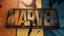
The brief from Marvel was open, with one specific request from Kevin Feige himself — to combine the brand and the iconic characters into a single image, showcasing the heroes within the letterforms of the MARVEL logo.
Otherwise, we were asked to approach this as a new chapter in the ever expanding story of Marvel Studios, and the new logo and animation needed to make that statement. We accomplished this by taking cues from the brand equity of the past, while showcasing the growth and expanse of the Marvel Cinematic Universe.
03
EARLY CONCEPTS
As with previous collaborations with Marvel, our process began by exploring numerous concepts. By experimenting with different conceptual and visual themes, we were able to not just propose solutions, but begin a collaborative process with the entire team at Marvel. We would come to agree on one concept that was unanimously the favorite, establishing the foundation for the logo development.
HOW TO BUILD A UNIVERSE
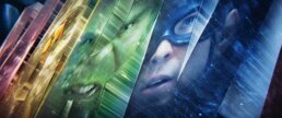
The familiar metaphor of stacked pages quickly expands into something much bigger, as we see a process through which classic tales are a seed awaiting tremendous growth and development. The powerful beam of creativity projects through comic books and museum glass, colliding with script pages and concept art. The dynamic cross-pollination breaks through these layers and sprouts into a rapidly growing universe. While these cosmos are ever-expanding, from a distance it always looks like one thing: MARVEL STUDIOS.
04
BUILDING A UNIVERSE STEP BY STEP
After a lengthy evaluation and decision-making process, Kevin Feige and the entire Marvel team asked us to develop the “How To Build a Universe” concept. Every Marvel film is the result of dedicated work from thousands of people from hundreds of disciplines in locations spanning the globe. The “How To Build a Universe” concept was designed to pay tribute to this process by touching on these key components:
- Legendary COMICS are the foundation and history
- Hollywood’s greatest screenwriters translate the themes of the comics to a SCRIPT
- The best production designers, costume designers, and artists create CONCEPT ART
- Incredible directors, cast and crew craft the FILMS
- A shared universe of various films & characters defines the MARVEL UNIVERSE
MARVEL COMICS
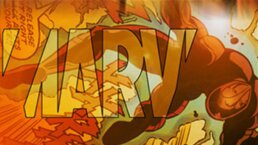
Since the very first Spider-Man (2001), and long before Marvel Studios was its own entity, any Marvel-related film began with some form of the ‘flipping pages’ logo. Our team was unanimous in wanting to pay tribute to this iconic animation, originally developed in 2001. As the new Marvel Studios logo animation begins, it is initially identical to the historic ‘flipping pages’ logo, both reflecting on and respecting the studios history.
FROM PAGE TO SCRIPT
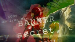
The stories that give these comic book characters nuance and depth in film are the crucial component in any Marvel Studios film. In the logo animation, we see various lines lifted directly from the script pages of various Marvel screenplays.
We wanted to find quotes that were both iconic fan-favorites, as well as lines that helped establish the breadth of the Marvel Universe. Some eluded to the entire spirit of Marvel Studios (“ FURY: The idea was to bring together a group of of remarkable people to see if they could become something more.”), while others encapsulated the depth within the rich characters (NATASHA: “I’ve got some red in my ledger”).
MARVEL CONCEPT ART
Marvel Studio’s films are overflowing with incredible realizations of characters, locations, vehicles, weapons and technologies. What you see on film was visualized years in advance by Marvel Studios’ brilliant head of Visual Development Ryan Meinerding and a team of incredibly talented concept artists whose paintings define the visual goals for the entire production.
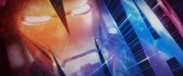
We mined through a massive archive of concept art and “The Art Of…” books, to select the most iconic images for each beloved character. Utilizing the original digital paintings themselves, our team animated each image being painted from scratch. The final touch was mapping this artwork onto 3D models (many left-overs from our Avengers: Age of Ultron title sequence) to giving these once 2D paintings a sense of depth as the camera moves around them.
Marvel Studios Logo Re-Design and Animation Iron Man Concept Art Animated Build
Marvel Studios Logo Re-Design and Animation Captain America Concept Art Animated Build
Marvel Studios Logo Re-Design and Animation Black Panther Concept Art Animated Build
BRIDGING CONCEPT TO FILM
The link between concept and film is a key turning point in the logo animation, and we explored several different approaches, characters and techniques to show these concepts coming to life in film.
MARVEL CINEMATIC UNIVERSE
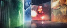
Marvel Studio’s catalogue of films are loaded with iconic moments and vivid characters, and we wanted to create an environment that would surround viewers with everything we love about each of the Marvel Studio films. In the process, we reviewed hundreds of selects made from each of Marvel’s films (13 at the time the logo was conceived), carefully choreographing timing and composition of footage showcasing numerous characters.
Altogether, there are over 70 pieces of footage that can be seen in the final logo. Editing, color balancing and getting clearances on each and every one was no small feat. Our team also explored numerous ways of arranging the footage within the form of the overall logo, ultimately leading to the “vault” where luminescent footage plays on the interior walls of the “MARVEL” logotype.
05
THE MARVEL UNIVERSE
An equally important responsibility and huge honor we were given, was to redesign and rebrand the logo of Marvel Studios itself. This is the brand identifier that is to be used across all Marvel Studios materials—hats, shirts, stationary, film posters, and all corporate materials across the universe.
Since Marvel Studios has evolved into its own powerhouse entity, one of the main tasks was to give the word “Studios” its own special treatment and power, while also keeping the balance with the word Marvel. Below is a small sampling of the many iterations the re-design of the logo went through.
Marvel Studios Logo Re-Design and Animation Case Study
06
FINAL MARVEL STUDIOS LOGO ANIMATION
On July 23, 2016 in front of a standing room only crowd in Hall H at Comic Con, the logo was finally unveiled by Kevin Feige to the world. Combined with music composed by Michael Giacchino, the result pays tribute to the history of Marvel Studios, showcasing the incredible effort that goes into each and every film every step of the way. The Marvel spirit drawn from comics, scripts, concept art and beyond is what makes Marvel Studios the force it is today. The new logo animation’s first appearance was on the Doctor Strange trailer at San Diego Comic Con, and it is slated to be seen at the open of every MCU films for years to come.
We are humbled and honored to have been the team selected to bring this journey to life along side of Kevin Feige, Victoria Alonso, Louis D’esposito, Jeremy Latcham, Danielle Costa and many other brilliant people at Marvel!
