01
INTRODUCTION
For the third movie in Marvel Studios' Thor franchise, Marvel Studios and director Taika Waititi decided to take Thor: Ragnarok in an entirely new and unique direction: a colorful, playful, comedic buddy adventure movie rooted in the visual tapestry of legendary Marvel Comics’ visionary artist Jack Kirby.
In the summer of 2017, we were honored to be invited to conceptualize ideas for the main on end title sequence. The first step was to screen an early edit of the film. From the moment the movie ended, we knew the main on end sequence needed to pay homage to the playful, retro tone of the picture. The design process was focused on balancing the strong visual language of the film with the individual characterizations and key moments in the story. Sprinkle in the 80s-arcade soundtrack and a very memorable title sequence was born.
Breakdown Video Documentary
02
EARLY CONCEPTUAL DEVELOPMENT
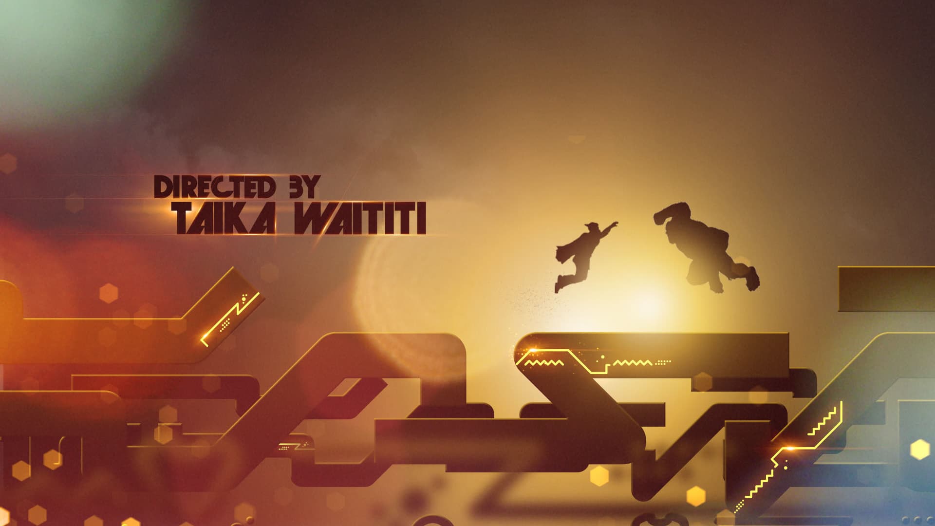
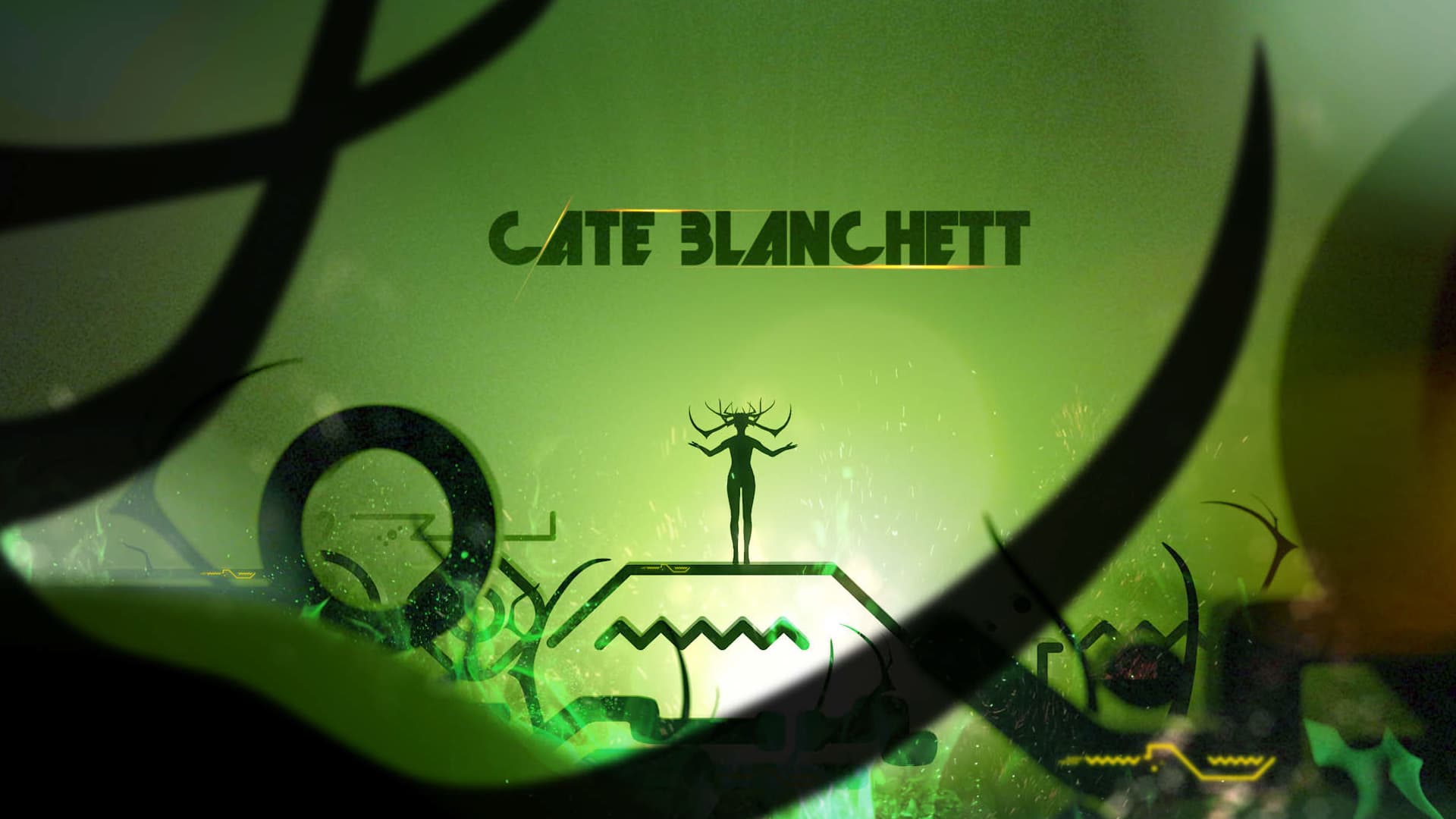
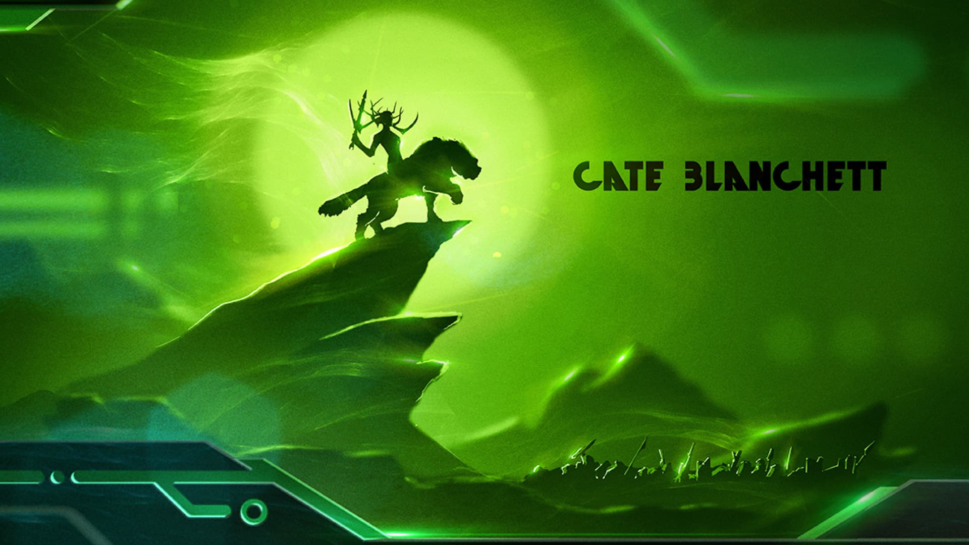
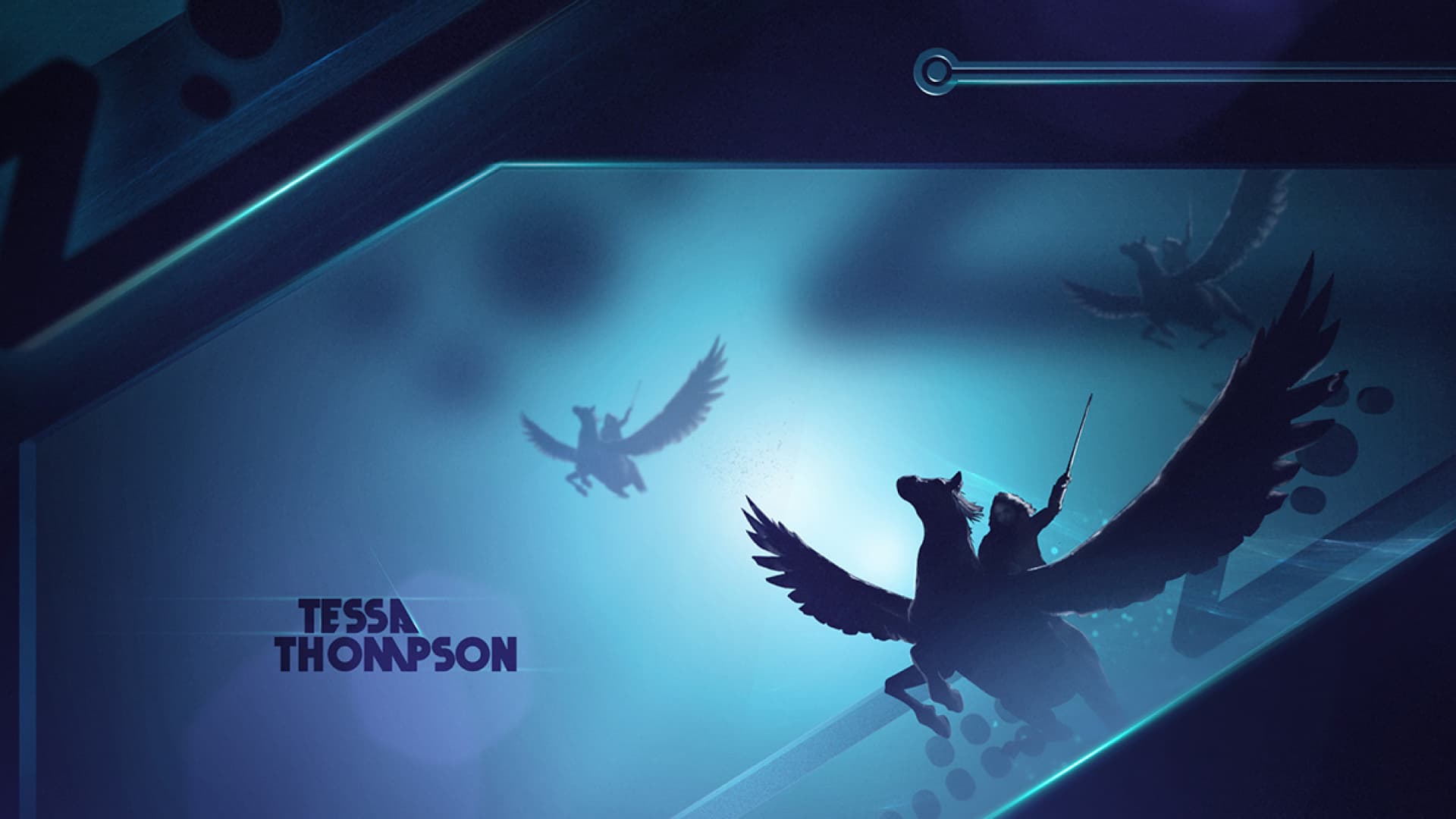
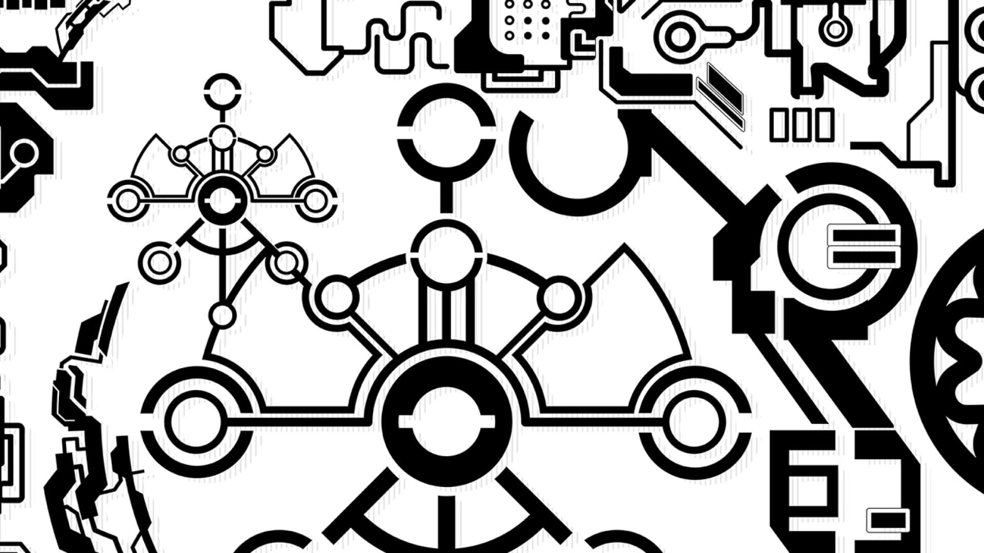
Asgard exists in the hearts, minds, and souls of its people, not just the soil where it’s mighty buildings once stood. Giant planetary orbs, each etched with Kirby and Asgardian inspired symbology and pictograms guide us through this heavenly sequence.
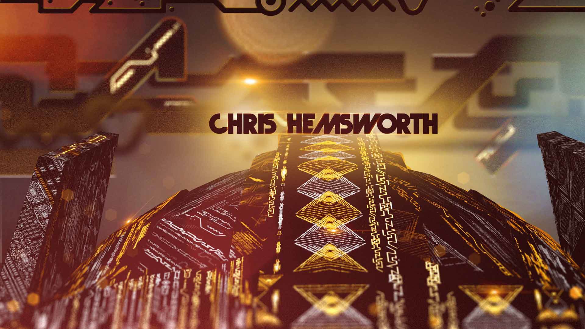
The behavior of these celestial bodies will forge relationships to individual credits in unique ways. For Chris Hemsworth, they will orient themselves to imply the circles on Thor’s iconic uniform, as charged lightning cycles between them. The shadows of Hela's antlers loom ominously to transition to cate Blanchett’s title card. Flickering points of light create a sublime cosmic ambiance, evoking the legacy of the Asgard civilization as it lives on to the next chapter of existence. These lights form an emotional connection that weaves the very fabric of the cosmos.
Thor: Ragnarok Main On End Early Motion Study
Another early motion test involved exploring a non-stop, expansive journey through an ever-changing, “Kirby-inspired” cosmic machine. The camera dynamically changes angles, pushing forward in all directions. Vast open chambers and mechanisms are infused with electrified Sakaar and Asgardian graphics that build relationships with each individual’s credit. This “architecture of the cosmos,” new worlds and spaces continue to surprise and delight—from internal spaceship mechanisms to architectural wonders of Sakaar/Asgard even to inter-planetary landscapes.
Design Refinements
03
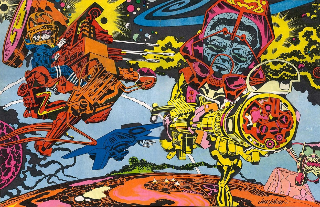
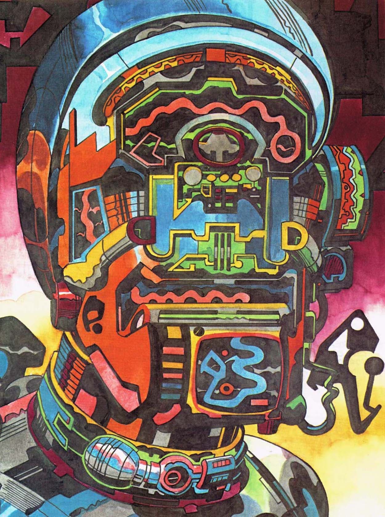
KING KIRBY
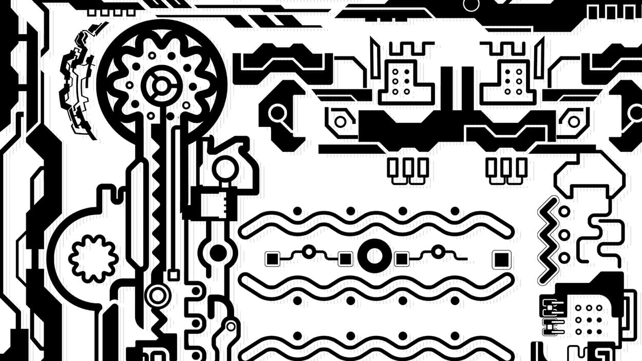
Jack Kirby's art is characterized by densely packed shapes and patterns, to an almost obsessive degree. To ensure that the sequence stayed true to this iconic visual language, we poured through tons of his art—from comics to sketches to paintings—and traced an extensive library of reference. These distinct shapes were then used as inspiration and at times directly lifted to create these Kirby-Esque dioramas.
04
THE PROCESS
While this Kirby shape bible was being crafted, we set out to create vignettes that would perfectly encapsulate key moments in the film. The goal was to carefully select moments to represent the characters, action, and humor in a bold and iconic graphic style. We explored close to 75 different vignettes, working closely with Taika Waititi, and the Marvel Studios team to focus them down to the 28 final scenes.
05
BREAKING IT DOWN
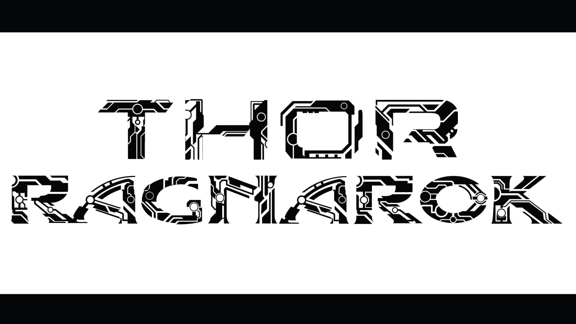
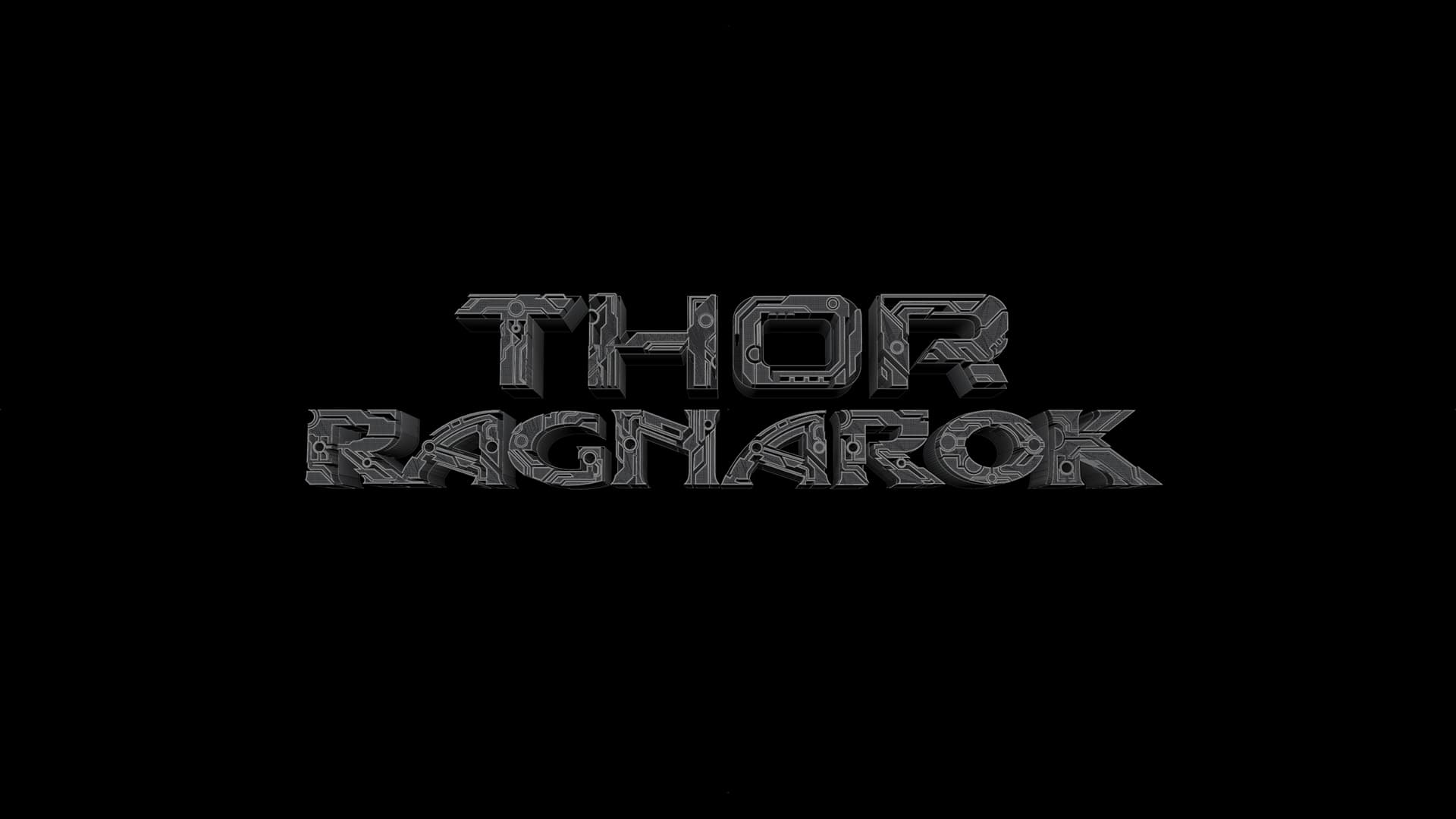
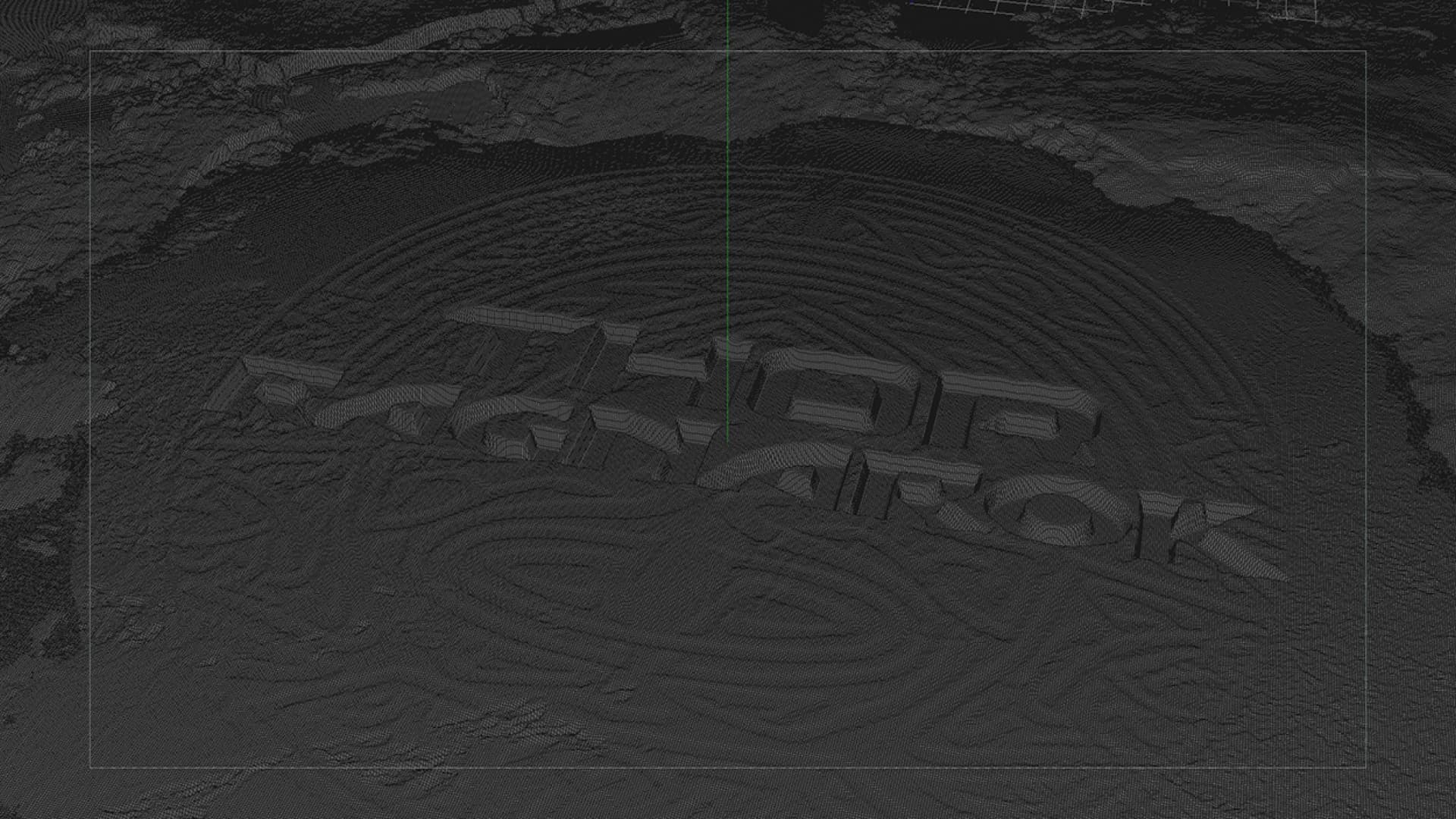
The bright—bordering on neon—colors of the final look are inspired by the vibrant palette and synth-like soundtrack seen and heard throughout the film. The Kirby inspired shapes frame a combination of 2D and 3D assets which are then composited together with generous amounts of volumetric light and atmosphere to complete the side-scrolling arcade look with an enhanced sense of dioramic depth.
THOR RAGNAROK Grand Master Section Breakdown
06
FINAL TITLE RESOLVE
The bright—bordering on neon—colors of the final look are inspired by the vibrant palette and synth-like soundtrack seen and heard throughout the film. The Kirby inspired shapes frame a combination of 2D and 3D assets which are then composited together with generous amounts of volumetric light and atmosphere to complete the side-scrolling arcade look with an enhanced sense of dioramic depth.

07
FINAL MAIN ON END TITLE SEQUENCE
Thor: Ragnarok Main On End Title Sequence
08
OPENING TITLE DESIGN
In addition to creating the end title sequence, we also created the main title reveal at the beginning of the film. Marvel Studios asked us to visualize this key opening title moment.
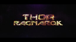
Thor, outnumbered by Surtur's minions and confronted by a fire breathing dragon, breaks through the top of a cave while calling for the Bifrost. Just as the dragon is about to devour our hero, the Bifrost opens and burns the Thor: Ragnarok logo into the ground of Muspelheim.
We kept the Bifrost's signature Celtic pattern in the ground and applied our “Kirby” treatment to the logo. A fiery, smoldering design is left in the ground as the logo rises up and flies towards the camera propelling us into the movie. It was a perfect bridge of opening title to a key story point.
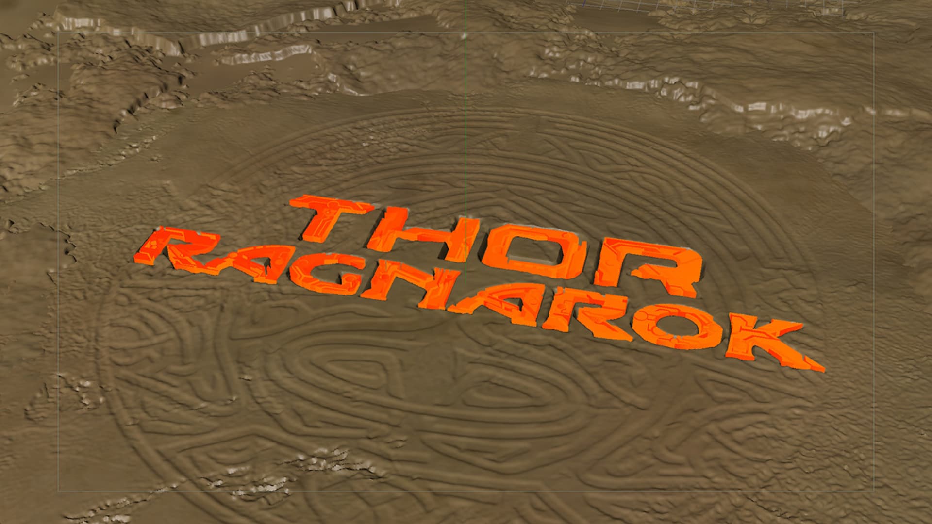
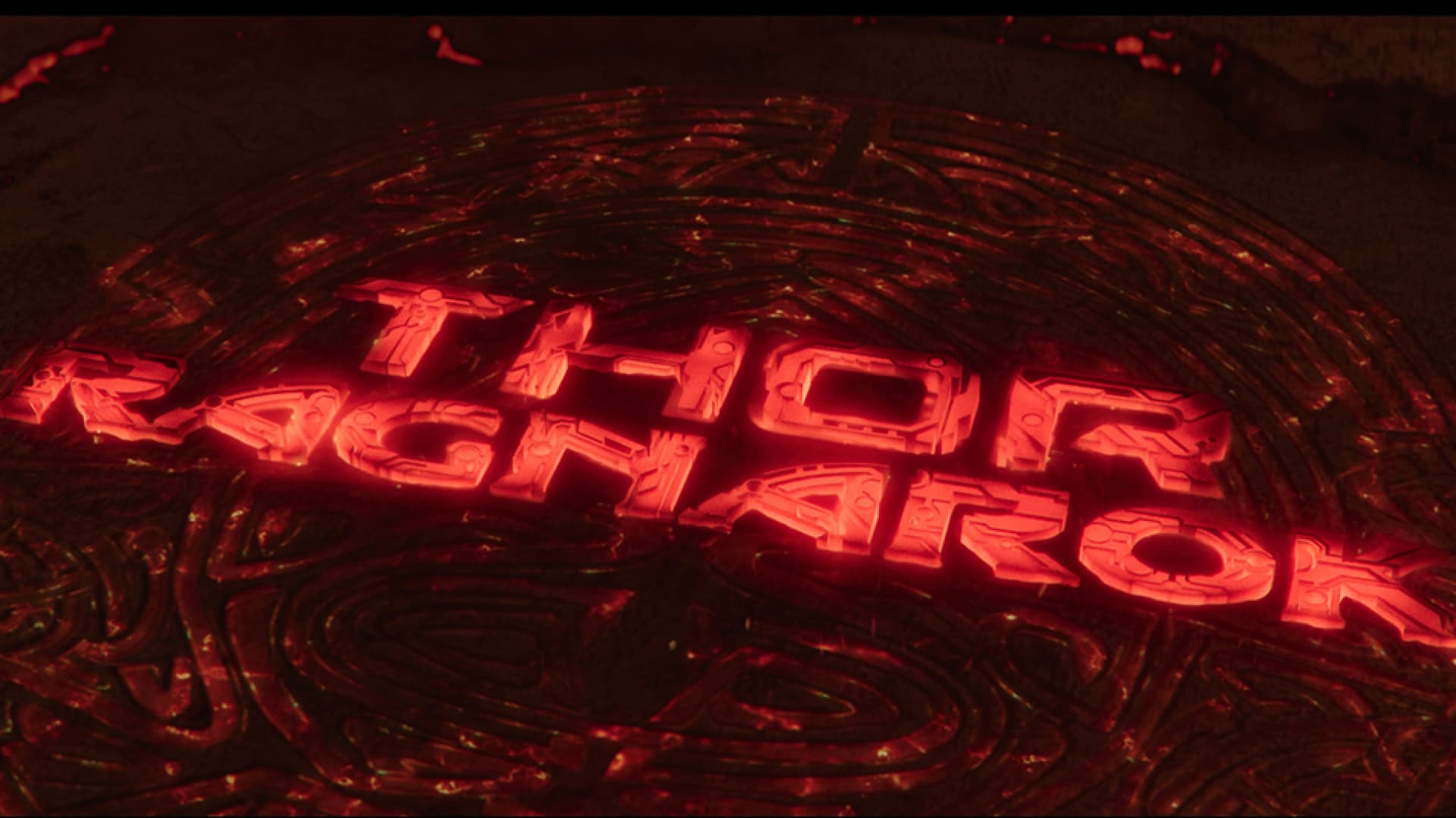
Thor: Ragnarok Opening Title Design
09
MARVEL STUDIOS CUSTOMIZATION
In 2016, we worked with Marvel Studios to rebrand their logo and intro animation. Since then, the Marvel Studios logo has been updated with new characters for every release but Thor: Ragnarok director Taika Waititi had another addition to the logo.
Instead of the logo cutting to black, it would slowly start to glow and burn until it was engulfed in burning hellfire as the camera rises up through a cave to reveal thor trapped in a cage. We worked closely with Method Studios, who created the cave side of the reveal, to produce a seamless transition from the fiery logo to the smokey cave.
For more of our work on Thor: Ragnarok click here for our tech design work case study for the film