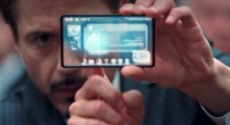
I am often asked how our extensive experience designing ‘sci fi UIs’ for feature films has any relation whatsoever to creating ‘real-world’ interfaces. “Aren’t those completely different universes?”
I love that question, because it’s astounding how truly similar and parallel the two worlds actually are.

For generations, science fiction has presaged science fact. The greatest writers’ imaginations crafted visions of the future throughout literature, that came to light decades later. From Jules Verne’s 20,000 Leagues Under the Sea in 1870 inspiring electric submarines in the 1960s, to HG Wells 1898 classic War of the Worlds’ influence on the inventor of the rocket ship in the 1920s, all the way to Star Trek’s late 60’s communicator device reincarnated in Motorola’s first cell phone—this influence is quite apparent and well documented.

Today, however, literature has taken a backseat to the visions of filmmakers, screenwriters and visual effects artists imagining future technologies on the big screen that will likely influence our future reality. In a way, movies function as the perfect prototype testing ground—allowing fully conceived characters (personas) to interact with gadgets and devices in very specific scripted scenarios (use cases). The more realistically designed and believable these technologies appear, the more likely we will see them in the real world. In the excellent book “Make it So,” Shedroff and Noessel elaborate: “..much real-world design is like sci fi, fictional. Even when interfaces are designed for actual products…they follow a process that is inherently speculative…”
After over a decade working in both realms, I’m continually fascinated by the similarities in the assignments we get from technology partners and from filmmakers. In my experience, I’ve identified four key creative objectives that consistently are expected of us, in all of our UI work, whether the project is for the ‘silver screen’ or the mobile screen.
I. STORYTELLING
Stories persuade, stories engage. Stories teach and they guide. Stories connect human beings on the deepest emotional levels. Telling stories is at the very root of both user experience design and filmmaking. It is also the foundation of every compelling creative brief I’ve ever worked on.
Much as a writer shapes a story, UX needs to begin with the user and the unique experience crafted around them. Deep dives into user research should follow, to build personas and discover the many different ways they interact and engage with the “story.”
Use cases and stories work hand in hand—both create fictional characters, in hypothetical situations, acting toward a very specific goal. Indeed, these scenarios are just like screenplays for a film—these are the precise stories we must invent for the user. We must aspire to take UX far beyond just information architecture—striving to attain a much higher level. We aim to create an environment where the entire experience from start to finish is crafted with the same ethos as history’s greatest storytellers. “…Audiences are a class of users, and the [true] test of a speculative interface is the audience’s ability to follow the narrative.” (Shedroff and Noessel).
I was recently meeting with a Senior Executive Director of UX at a major automaker who described their product range of cars as different characters within the main brand’s storyline. As such, each “character UI” must have their own unique identity and personality, but they all need share the same family DNA. I’m a big fan of that perspective and immediately reminded of Marvel’s brilliant ‘pecking order’ of UI ‘coolness’ across their character universe. The recent release of Black Panther and the technology of Wakanda has taken over Tony Starks reign as the top of the tech food chain. Tony Stark stood high above all, at the top of the UI food chain, and every other Marvel character’s interfaces—from SHIELD to HYDRA—must be deliberately designed below this ideal standard.
When it comes to cinema, the UIs we create have moved straight from background set dressing thats out of focus to front and center, full screen interfaces responsible to hold the attention of the audience and move the film’s story forward. Indeed screens have now become full supporting characters in the cast, communicating and interacting with our heroes and villains as much as any other paid actor in the film. The art and science of designing these interfaces, is as much about look and style, as it is about the information architecture,the exact words and the meticulous sequencing. These sequences MUST happen, at exact cues, and time out precisely to actions within a scene. Without a doubt, if the interface is confusing, illegible or out of sync, the entire scene fails, and the story begins to fall apart.
II. CINEMATIC EXPERIENCE
I consider a true cinematic experience to be one that gives the user (audience) a delightful escape; having the power to move them toward another emotional state. Completely creating a full sensory experience that is both compelling and immersive, and is truly larger then life, is a creative goal to aspire to, no matter what size screen we are designing for. A cinematic UX has the exceptional ability to create and evoke a story in viewer’s mind.
Beyond the UI experience are the fine details such as the level of quality and the production value. This ‘fit and finish’ to the design can either elevate it to the highest planes of cinematic beauty, or immediately tear down the illusion breaking the metaphorical ‘fourth wall.’ When working on a film specifically, our UIs must always have that extra touch of light, ambience and dimensionality that help lift it right off the screen and fully immerse the audience.
Stimulating as many senses as possible (including effective sound design and touch haptics for example), can help tremendously in shifting the user’s consciousness and transcend the limited confines of the screen. We must strive to imbue this grander, emotional, and powerfully immersive experience into all of our UIs, and only then does it reach the cinematic level.
III. ENTERTAINMENT VALUE
Of course, it’s not enough to just create a beautiful cinematic visual experience. It is of equal importance to completely entertain the user (audience). Once you’ve caught their attention, it must be carefully held onto. The user must be engaged and enchanted throughout; they should not want to get out of their seat or even blink from the screen—we want them spellbound.
For any hardware or software developer, having the user never want to put down a device or turn off a particular app, is an essential goal indeed. If the user easily loses interest or gets distracted, then the device or software has failed on a fundamental level.
Similarly, when a UI fills the screen during a key scene in a film, if even for that brief moment, the audience attention is lost, then the entire momentum the filmmaker has worked so hard to build is now broken. That arc must always be continuous with no breaks or cracks. Thus, film UIs must work that much harder to entertain and captivate audiences so this vital flow and pace can never be interrupted.
Oftentimes, a filmmaker will use the UI to strategically plant ‘easter eggs’ of information that contain ever deeper levels of meaning to the story or characters involved. Even on a subconscious level, these flashes of information can help to entertain today’s sophisticated audiences, who are constantly scanning every piece of blinking type before their eyes. Certainly a viewer’s interest level can remain quite high with repeat viewings, as more and more layers to the story will be revealed.
IV. “SOUL”
This is a term we affectionately use in the studio to describe the personality that a successfully designed UI must have. The way I see it, a UI is a fully living, breathing system, that engages and communicates with its users on multiple levels. It is the visible “face” to the software or hardware, and as such it is the true window to its soul. It must feel organic, user centered, approachable, and avoid appearing one dimensional and cold at all costs.
Ultimately, this is the purpose of its design—that every detail has been carefully considered, and the human touch is visibly apparent and omnipresent. This is the true “soul.” Jarvis, the glorious supercomputer with all of its supreme artificial intelligence has not been self created by it’s own silicon, rather it could only have been by the soulful hand of Shuri and her lab in Wakanda or Tony Stark and his one of a kind artistic mind and vision.
——
With all of these profound parallels, there is a certain irony when we are given contrasting creative goals for our assignments from technology clients versus directors. Filmmakers consistently ask us to “make it real, make it authentic, make it genuine” and indeed we must, as today’s film audiences can pick apart on-screen interfaces and instantly recognize when they are fake and not completely thought through. Audiences have become more and more tech savvy and sophisticated each and every year, and as UI designers we must rise to the challenges of their closest scrutiny. Treating film UIs no differently than real software is one of our biggest goals. On the other hand, technology brands, inspired by the futuristic vision we bring to the film screen, seek us out to “…Make it look like it does in the movies, make it look fantastic, visionary—JUST MAKE IT LOOK LIKE IRON MAN!”
And truly, Tony Stark, Jarvis & the world of Iron Man have become such a part of the zeitgeist—he’s the apotheosis for all of future tech and the epitome of the highest levels of design innovation so many aspire to become. We will soon see a similar inspiration from Black Panther and the technology of Wakanda that will further spark innovation in everyday technology in our future.

Jeremy Lasky
An entrepreneur and creative leader, Jeremy Lasky started his career at R/GA right after graduating from Carnegie Mellon University where he studied Graphic Design, Architecture and Business. For 5+ years he lead design efforts for feature films, global ad agencies and broadcast networks. In the Fall of 2001, Lasky co-founded Perception, a cutting edge motion graphics studio that lead the revolution in creating groundbreaking design and visual effects on the desktop. Now in it's 18th year, the studio has sharpened its focus to become global experts in designing futuristic UIs for both feature films and for the most powerful brands in technology. From Iron Man to IBM, from The Avengers to SpaceX, the studio has an extremely unique niche that truly bridges the gap between science fiction and science fact. Lasky leads new business strategies, shapes the company’s growth, while overseeing a full-time staff of 15.
Lasky has been a keynote speaker and presenter at: Promax 2016, Disney Art Summit, Disney Creative Loop Series, Science of Team Science Conference, Biogen Techology Innovation Symposium, TV of Tomorrow Conference, and Razorfish's Global Creative Summit. Lasky has lectured on design and guest speaker at OTIS, SCAD, Carnegie Mellon’s ETC and NYU ITP. He's also given presentations and workshops at some of the biggest tech giants in the world including Samsung, IBM, SpaceX, Intel, Microsoft, GE, Yahoo, Audi, Mercedes, Ford, Chrysler, Visa and Apple.
Lasky’s work has been featured in dozens of design and industry publications and he has garnered many of the most prestigious awards in the design world including AIGA, The Art Director’s Club, Broadcast Design Association/Promax, CLIO, International Andy Awards, Monitor Awards, New Media Invision Awards, One Show Awards, The Charleston International Film Festival Awards, Telly Awards, and The Type Directors Club.


