When you sit down to watch a television show or a movie today, you probably are expecting to watch a title sequence at some point during your viewing experience. Whether it’s a sequence that opens the production or closes it with a bang, we’re all anticipating (and hoping) for some memorable titles.
We have a long history of creating title sequences here at Perception, especially for Marvel Studios’ films and series. Our first ever Marvel title sequence was for the Hulk vs. Wolverine animated feature. Since then, we’ve created sequences for some of the biggest Marvel Studios’ productions, including Avengers: Endgame, Black Panther, and WandaVision, which earned us a 2021 Emmy nomination for Outstanding Title Design.

But as we work on these sequences, sometimes we like to reflect on why these sequences are so important and what makes them so special for every party involved in the film.
A title sequence is a tool for the audience. It’s a way to help the audience buckle up for what they’re about to watch or come down from what they finished experiencing. It isn’t just a parade of names and cool visuals, but rather, it’s something that is a little extra feature to help set the mood of the show or film. It puts a stamp on what the filmmakers want to say and how they want you to feel.
For those who worked on the production, a title sequence is a round of applause. It’s almost like an exhale after the hard work is done and a way to see that hard work credited. Plus, when that credit is paired with brilliant visuals and dynamic typography, it’s even cooler!

And for the designers, a title sequence is an exhilarating project that compliments the film or show. Essentially, a title sequence is a two minute short film to accompany the greater film. It’s a way to test out different design techniques and create something completely unique and true to the production that may be out of the realm of their typical design style.
Since title sequences have become such an important part of film culture, it’s equally as important to make sure our team creates a sequence that is entertaining, visually dynamic, and adds to the film.
For us, a good title sequence needs to be something that relates to the movie or the show in some way. It doesn’t need to be a literal retelling, but there needs to be distinct thematic links. We always are mindful in remembering that the sequence needs to tie into the show so if someone were to watch that sequence without the main title attached, they would be able to tell what show it’s for.

One of the ways we tie the sequence into the show is through the visuals. The visuals, while fun for us to craft and create, are truthfully essential to building a good sequence since title sequences are a secondary visual story. The visuals should, ideally, match the aesthetic of the show. As easy as it is for us to potentially get carried away with something that just looks cool, we always go back to the idea that any imagery used should represent something a little deeper, a little more thought provoking. We want the sequence to leave the audience wanting more and interested in learning more. The details of a title sequence play a large role in that.
For example, one thing we really like to focus on is the typography we use. We often experiment with different fonts to see what feels right, because different fonts will change the feeling of the sequence even if the imagery is still the same. We could have a dark, crazy sequence full of gothic architecture and whether we put a serif or sans serif font on it will change the entire meaning of that image. The typography adds another layer to the sequence, and the little flourishes of the font we choose add to the mood of the piece.
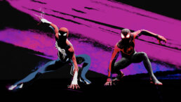
I always love using our title sequence for Spider-Man: Homecoming and Spider-Man: Far From Home as examples of this. This sequence for Spider-Man: Homecoming was meant to look as though it was created by high school students in art class. The visuals, made up of clay, hand-drawn sketches, and school supplies, give the sequence that real art-class feeling. The typography on top of it, modeled after a student’s handwriting, further emphasizes that idea and brings the playfulness of the sequence to life.

Meanwhile, our title sequence for Spider-Man: Far From Home utilizes many of the same visuals – hand drawn features, paper, school supplies, etc. But the typography of that sequence is more structured and detailed with flourishes akin to those seen in spy movies, representing the more mature, global adventure and S.H.I.E.L.D. related activities seen in the film. The two sequences have similar images, but the typography separates their moods.

When we create a title sequence, every piece of it is thought out like this. The size of the type, the shadows in the background, the speed of the transitions…it all ties the sequence together to create something visually captivating and thought provoking. We always want to provide the audience with more to think about, a moment of reflection, and at best, evoke a true emotional reaction.
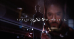
I remember when we designed the main on end title sequence for Avengers: Endgame. That sequence was wrapping up the journeys of several characters and actors, and concluding a story that spanned over 20 films. President of Marvel Studios, Kevin Feige, had the idea of the sequence being reminiscent of a curtain call, where it felt like the actors and characters were both taking their bows. With this in mind, we began creating something that would bring everybody together – the fans, the actors, and the filmmakers – to celebrate this epic conclusion. The result was people cheering, applauding, and even crying once they watched that title sequence. Our team made something impactful that stayed with the audience as they left the theater – and that is always the goal.
To me, the best title sequences are the ones that make the audience feel something. They are the real ending to a movie or intro to a TV show. They set the mood or cleanse your palate. If you sit through a title sequence and it makes you feel excited, or relieved, or contemplative, then we’ve delivered on creating a truly cinematic experience.
Doug Appleton
Doug Appleton is Perception’s resident VFX wizard. Formally taught in the world of motion graphics, Doug’s first job out of college was at Perception. He has been with the studio ever since.
Doug has grown with the team from their early days and has continued to flourish up the hierarchy as he learns and masters the intricacies of the film and technology worlds. His skill in successfully executing a diverse array of projects in the world of motion is matched only by his curiosity of the technology itself.
Doug’s projects have ranged from detailed UX interface projects for high profile security clients, to lead animator on title sequences for Avengers: Age of Ultron. As a director he often works with his team and clients to problem solve as a unit, encouraging collaboration and confidence.
In addition to VFX guru, Doug is also Perception’s resident Marvel database. A huge fan of the series and of exploring the unknown, Doug likes to collect memorabilia from all major projects, with the love and support of his wife and two feline friends. He is also known as “The Encyclopedia”.
