Car’s dashboards are more advanced than ever, but can they still be special?
I fetishize instrument clusters. As an automotive enthusiast who spends his days conceptualizing user interfaces, it is as if the instrument cluster exists to fascinate me alone. In our increasingly digital age, my fascination has transitioned to frustration. The digital world has collided with the instrument cluster with little elegance. But there is hope. There are answers in the past and solutions in the future that will finally bring Soul to the Digital Instrument Cluster.
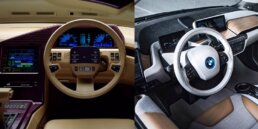
We are in the middle of the biggest shift in automotive instrumentation ever seen. Digital displays offer more flexibility and content than could ever be displayed with dials and analog needles. Drivers expect more data, better design, and thoughtful experiences — not unlike what we experience with our personal devices. And the automobile occupies a unique space in a drivers life… how many people do you know who have named their iPhone? It’s always expected that a new wave in technology will be unrefined. But the majority of digital instruments in modern vehicles feel as though they are not just falling behind, but desperately missing the passion present elsewhere in transportation design.
We’ve been down this road before
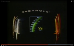
Digital instrumentation isn’t a radically new idea in cars, and has already been through several waves of relevance. In the late 70’s and early 80’s the instrument panel (and other aspects of the vehicle) were given what felt like cutting edge technology. LCD displays, console computers controlling HVAC & Audio, even a pre-Siri voice that with the best intentions would tell you “THE DOOR IS AJAR”. These systems seemed impossibly futuristic. The 1984 Corvette advertised its dash as if it was alien technology.
In hindsight, these space-age advances quickly aged out of relevance. Each car with a digital dash was replaced in the following generation by traditional dials and needles, and this brief advance in design and engineering was quickly regarded as a tacky, tasteless exercise.
Analog elegance and the wristwatch
Early LCD displays in cars had an obvious parallel — the advent of the digital wristwatch. Both were briefly exciting and fascinating, while neither made the preceding analog dials obsolete. While the digital wristwatch has found it’s place, it never tarnished the appreciation for the timeless craftsmanship that goes into an analog timepiece.
From Racers to Rich Kids of Instagram, there has always been a connection between fine wristwatches and high-end automobiles.
Clockwise: Steve McQueen adorned with his Tag Heuer in “LeMans”, Blancpain sponsored Lamborghini spec racing series, Various not-so-humblebrags via Instagram, Rolex contributes sponsorship to various international racing series, F1 Champ Lewis Hamilton’s IWC sponsored racing gloves.

Much of the aura of an mechanical wristwatch comes from the awareness that beneath the watch face surface there is a system of gears, springs and perfectly balanced wheels, precisely orchestrated to keep accurate time. This appreciation easily extends to the engineering present in the automobile, which packages thousands of precise components into an aesthetically pleasing package.
A wristwatch is accepted wether it’s as simple as a sundial or as complex as a modern OS. Expectations for the instrument cluster now include navigation, (backup) camera displays and more. These expectations will necessitate some form of digital display, and it’s only a matter of time before the digital dash is as ubiquitous as cupholders.
Digital flexibility and smartwatch
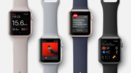
The latest batch of digital instrument clusters have come a long way, and typically have more in common with a modern smartwatch than with the 1984 Corvette. The entirely digital instrument cluster enables flexible features as well as detailed design and animation. The modern smartwatch has a primary function — to tell time. But each smartwatch concept has a suite of additional functions (maps, health metrics), as well as alternate watch-face designs. It should be noted, that nearly no smartwatch displaysskeuomorphic watch faces… even when referencing physical watch designs, the the graphics never try to replicate real world materials or surfaces.
Various apps and functions for the Apple Watch
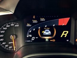
Sports cars like the Corvette (C7) reconfigure the layout and design of the display based on the driving mode (track mode = more technical displays, etc). Various grand-touring Audis will shrink it’s virtual gauges to make room for a large navigational map. The all-electric Tesla Model S will display energy management metrics, amongst other controls.
The C7 Corvette Multi-Function Display
Countless manufacturers are replacing the entire instrument cluster with a singular display integrated into the binnacle behind the steering wheel. BMW’s i3 (a car seen as a technological showcase) has a decidedly un-integrated instrument cluster, looking more like a tablet temporarily docked on the dashboard than a permanent piece of the car. Despite appearances, the BMW i3 instrument cluster is not removable.
Expectations in the age of the mobile OS
These modern displays are high resolution, with millions of bright, vivid pixels, not unlike a modern tablet. But the hardware is only a canvas, and there’s many important decisions to be made about which pixels illuminate, and why. Brand-new possibilities, and gee-whiz technology can be seductive and misleading for the design process. This is evident in numerous digital instrument panels, who’s layout and design seems generations behind the standards and trends of UI design.
In a modern culture who’s technological tastes are being defined (and continually redefined) by rapidly advancing smartphones and tablets, the automotive world faces a challenge. Lengthy development cycles, and complicated regulations make it difficult to avoid being lapped by the design of mobile operating systems.
Cadillac’s dashboard layout in the new ATS-V has drawn attention for being an underwhelming attribute in an otherwise outstanding car:
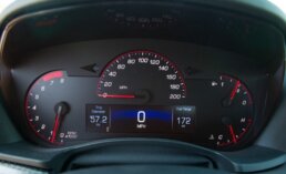
“Unfortunately, the ATS’s under-designed and chintzy-looking gauge cluster carries over to the V models with only a switch to red needles and accents for the analog dials and the same tiny, poorly integrated color information screen.”
The Mercedes-Benz S-Class is the international benchmark for luxury cars. The interior is an indulgent combination of luxurious materials with apparent craftsmanship and rich smells. However, the instrument panel is comparatively disappointing — the virtual dials have a digital representation of a chrome bezel around them.
The digital dash, seen in Mercedes most luxurious model, the S-Class
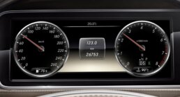
It should be noted — the dashboard of the Mercedes hasn’t been critically panned by critics or enthusiasts. Like the Tesla Model S and similar vehicles, the dominant impression left is that the car has a large display, something that is still a novelty even in high-end cars. While our expectations for the latest mobile device interface is to see rapid iterations of improvement at least every year, we seem to be less critical of the automobile industry, who’s iterations evolve every 4–8 years. But the tide is turning, and soon our automobiles (and anything else in our life with a screen) will be scrutinized by even casual users, whose expectations are set by the design and engineering of tech-giants.
Designing right-now for heirlooms
A smartphone’s lifespan gives it between 1 and 5 years before the first, second, or maybe even third owner places it to permanent rest in a drawer or a recycling plant. Even the most disposable of appliance-grade economy cars will be on the road for 15–20 years, and go through any number of owners. Special vehicles — beloved designs, sports cars, or cultural icons will have energy flowing through their veins for generations, and will transition between owners and collectors countless times. The industrial design of an automobile exterior can age gracefully over the years, while UI design ages like a child star’s post-pubescent downward spiral.
So how do you design something within the confines of the current state of technology, that will feel special today, without becoming cliche in 2, 5, or 15 years?
Physical appeal in a digital world
The digital display has been used in automobiles almost exclusively as it is in other formats — as an uninterrupted rectangular plane of information. Sometimes the shape is slightly masked, sometimes some small trim is glued to the display, but overwhelmingly it appears as though the geek squad mounted a rectangular screen on a otherwise sculptural dashboard.
With various advances in display technology, there are numerous, simple concepts that could be explored to bring the physical appeal back to the instrument cluster:
- A digital display with a hole in the center, allowing a mechanical needle to affix to the display surface. When the spinning action of the needle is in sync with the display, graphics can respond to the needle itself as it sweeps across the display, appearing to leave sparks, or green leaves behind it.
- Transparent displays can be used as the protective lens in front of an otherwise traditional mechanical needle. On the surface, graphics can display any information necessary, and either synchronize with, or override mechanical instrumentation behind.
- Different kinds of refractive materials (crystal, glass) could be affixed to a digital display surface in specific regions, allowing areas of the display to appear as though they are at different depths, and creating a more dimensional display.
Allowing the digital display to be… digital
The use of a radial gauge on a digital display, is effectively using a design based on technical limitations within a medium where no such limitations exist. This conceptual faux pas is only made worse when “virtual” gauges are designed to have physical traits — shadows, dimension, and material surfaces. Even worse, the faux-physical attributes or the radial layouts do nothing to improve legibility, and can limit the overall information hierarchy.
Instrumentation in Mclaren’s 2014-spec Forumla 1 car
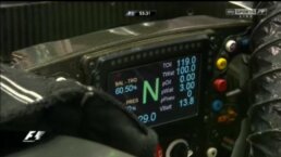
Racepak’s instrument cluster, commonly seen in high-end race cars.
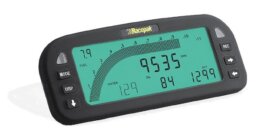
By allowing the digital display to disconnect from the past and embrace the flexibility of digital information design, there are many new ways in which the instrument cluster can communicate even better with the driver. Bar graphs, bold numerical readouts, and other informational systems can be utilized to convey clear information. This approach can be seen in various “mission-critical” interfaces. Spacecrafts. Military aircraft. World-class race cars. Their spartan, minimalistic approach not only conveys the information clearly, but it also suggests a seriousness… a responsibility to their purpose.
The intent is not to create something devoid of style, but to allow the aesthetics to be a byproduct of the purpose — not unlike the original radial gauge design itself. Thoughtful designers will always be able to introduce clever details that only enhance the experience, rather than decorate it. While trends and tastes in colors and typography will always change, functionality will always age much more gracefully than style.
The 2017 Ford GT’s spartan instrument cluster.
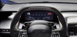
In the 11th hour of the instrument cluster
One of the reasons I am so passionate about making a mark on this canvas that I love, the instrument cluster, is because it’s days are limited. As an inevitable autonomous future approaches, there will be some need for instrumentation.
Instruments will need to provide drivers with the information they need to smoothly transition between manual and autonomous driving. They will need to instill confidence in a driver-turned-passenger. There will be several challenges and many fun problems to solve (and more to write about), but eventually, the instrument cluster will not exist at all.
So as we enter what may be the final generations of the traditional vehicle, it will be an opportunity to perfect everything that we love about driving and connecting with the vehicle. I look forward to continuing my own efforts, and witnessing many others who work to build an emotional relationship between car and driver through the digital instrument cluster.
Experience Perception
Perception is an Emmy nominated design lab pioneering the visionary process of Science Fiction Thinking to architect the future. We divide our time equally between the parallel worlds of science-fiction—working with trailblazing filmmakers, and science-fact—collaborating with the world’s most innovative technology brands.
