Video games offer a unique opportunity for UI designers since they often live at the intersection of fantasy and reality. First and foremost they need to be usable for the players so typical UI principals need to be considered. But at the same time many take place in different realities, worlds, and universes — there’s just too much opportunity for creative story-telling to not explore new and interesting ways to give the player feedback and functionality. When the right balance is struck they can serve both usability and creative story-telling/immersion. These days we’re seeing more and more ground-breaking UI come from video games and it seems that things are just getting started.
In the early days of video games, UI was often purely utilitarian giving the player just the most important information (think Pong), but as games become more advanced and hardware more capable, it’s affording designers and developers to push the UI to places it hasn’t been before. These days some games are integrating the UI into the environment, taking cues from augmented reality aesthetics. A recent example of this is Ubisoft’s sprawling Manhattan RPG-shooter The Division, which takes place in a post-viral outbreak NYC. It features UI elements that track on and around the character as they move through the environment.

The HUD itself lives next to the player at all times, showing vital details about health, ammunition count, etc.
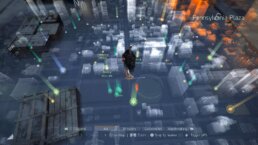
The map comes up in the environment as a hologram around the player as the camera takes an overhead view. Even in-game functionality, such as throwing a grenade, starting a new mission, and healing have AR-style feedback elements, all of which are usable, well-integrated and visually pleasing.
On the opposite end of the spectrum there are games that have a much more retro-futuristic aesthetic, like the Creative Assembly’s Alien: Isolation which models its UI elements from the 1979 movie Alien. Everything feels intentionally analog and utilitarian. Very little is ever displayed on-screen like a HUD, instead favoring screens in bulky hand-held devices or wall-mounted CRT TVs that the player can interact with.
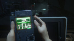
It was designed to feel slow, clunky and awkward with buttons and controls that aren’t always intuitive to give the player a sense of urgency and dread to great effect.
We can’t talk about video game UI and not discuss HUDs. They have been around long before the first-person games came along, but FPSs certainly made extensive use of them and for good reason. HUDs are great for giving players immediate at-a-glance feedback during what are often very fast-paced games. Early first-person games like Wolfenstein 3D and Doom (both by id software) even featured the face of the character in the HUD that would grimace in pain when shot or grin maniacally when using a particularly large gun. A few years after Doom we had Nintendo’s Metroid Prime (2002) which featured arguably one of the best HUDs even by today’s standards.
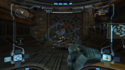
Not only was it usable and intuitive but stylish and fit really well into the aesthetic of the world. The entire screen was warped to look like it was wrapping around the face mask of a helmet and you could even catch glimpses of the characters face reflected in the light of an explosion or gunfire.

The HUD offered different vision modes which all were very different while still remaining familiar due in no small part to the simplicity of the underlying UI elements.
Now that VR is here, it’s offering some unique opportunities for designers to create more immersive HUDs and UI, particularly for games that feature a cockpit.
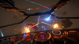
Games like Elite Dangerous, Star Citizen and Hawken are all examples of games where VR can really make the player feel like they’re at the helm of a giant robot or spaceship by placing UI elements in the cockpit itself.

Racing games are particularly ripe for this technology where the player could glance at the mirrors or look at the instrument cluster to get information instead of having floating HUD panels on the screen, further immersing the player in the experience.
The next big shift in game UI will likely come in the form of hand-held controllers for VR (like the Oculus Touch or the HTC Vive controllers) which literally add a new dimension to the interactive potential.
The ability to interact with objects in all three dimensions means we can have a truly spacial 3D interface, allowing objects and menus to be placed behind one another and arranged in space around the player. As the hardware improves and gets more refined, game UI will take on whole new forms in the coming years as designers and developers push the envelope in this fledgling space.
As games and hardware are becoming more advanced, the UIs too are becoming more integrated, more powerful and better at helping the player tell the story. We at Perception are excited to be inspired by, and participate in, the future of where game UI is going.
Experience Perception
Perception is an Emmy nominated design lab pioneering the visionary process of Science Fiction Thinking to architect the future. We divide our time equally between the parallel worlds of science-fiction—working with trailblazing filmmakers, and science-fact—collaborating with the world’s most innovative technology brands.


