01
INTRODUCTION
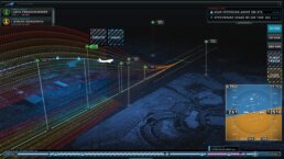
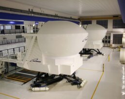
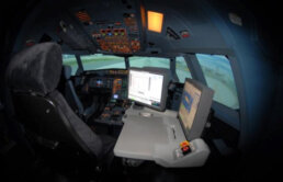
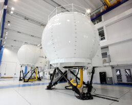
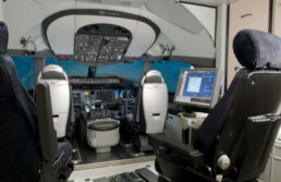
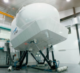
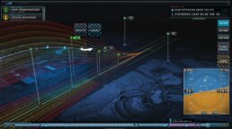
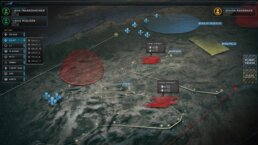
CAE recruited our team at Perception to reimagine the HMI for their state-of-the-art flight simulation equipment. The CAE Instructor Operating System (a workstation within the simulator pod) was overdue for an update, and we were tasked with developing a cinematic approach that would reflect the sophistication of these multi-million dollar marvels of engineering.
The project included a redesign of the current UI and a reorganization of the touch controlled OS to streamline instructors capabilities to navigate through the software. Our approach involved dual parallel processes of visual design and UX. Perception’s artists began conceptualizing new and inspiring ways to visualize the user interface, while the UX architects began breaking down the existing structure.
02
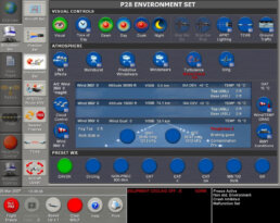
EXISTING UI DESIGN
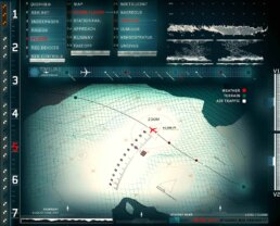
CAE provided our team with their current design, expressing that they knew that the UI needed to be more contemporary. CAE is known for their high technological and engineering standards, and they wanted the UI to represent those expectations.
03
UI DESIGN EXPLORATIONS
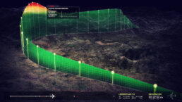
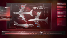
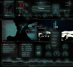
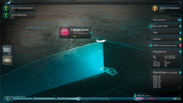
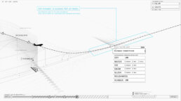
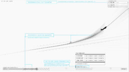
CAE’s initial request was for our team to conceptualize inspirational "bleeding edge" UI, keeping ideas of the distant future in mind. However, after the initial exploration, a particular direction triggered executives to change the structure of the project, and one of the more grounded concepts was fast-tracked for execution. This now meant teaming up with the engineering team to make it work immediately.
04
UX DEVELOPMENT & WIRE FRAMING SCENARIOS
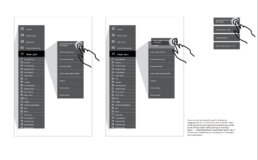
After interviewing veteran and new CAE instructors, we rapidly iterated wireframe concepts at varying levels of fidelity. One of the unique challenges from the instructors was to maintain a UI system that accommodated both instructor types, veterans who didn’t want to learn a “new” system, and less-experienced instructors who were more advanced in digital realms such as tablets and smartphones.
05
APPROVED DESIGN
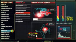
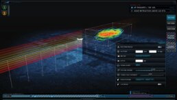
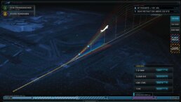
CAE chose the direction that not only felt futuristic, but also could be implemented immediately.
CAE executives were so impressed with our UX for the commercial flight simulator that they asked Perception to also investigate and reevaluate the experience for their military division with regards to combat missions for both land and air. This took the UX and design to a completely different level with mission critical thinking. The research took the Perception team down many paths which included search and destroy, recognizance and safety simulations in both jet and helicopter use cases. Imagery for this project is limited due to the secure nature of the project.
06
ANIMATED PROTOTYPE
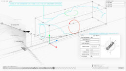
Our team developed several animated prototypes to give CAE tremendous foresight on the abilities and capabilities of the Instructor Operating System. This allowed instructors, engineers and pilots to contribute to the process much earlier than expected, ensuring a final product that is perfectly suited to their needs.
07
CONCLUSION
By refining the flow and interactions the instructors had with their screens, our team at Perception was able to streamline each simulator session dramatically. We were able to save CAE two hours per day, which correlated to more session time for CAE clients ultimately affecting the bottom line. CAE executives were ecstatic with the ROI and the cutting edge design that our team created!
