01
INTRODUCTION
Our team at Perception partnered with Amazon to conceptualize and design a suite of technology for their Italian spy drama series, Citadel: Diana. In this year long collaboration, our team contributed nearly 400 shots to the series, with an average of 70 shots appearing in each episode. From handheld spy gadgets to large scale interfaces, our technology established the design language and technological climate of the Manticore organization.
The project included a redesign of the current UI and a reorganization of the touch controlled OS to streamline instructors capabilities to navigate through the software. Our approach involved dual parallel processes of visual design and UX. Perception’s artists began conceptualizing new and inspiring ways to visualize the user interface, while the UX architects began breaking down the existing structure.
02
CITADEL AND MANTICORE
Our team was brought in due to our past science fiction technology work and contributions to the original Citadel show, which included crafting a complex narrative sequence to describe the history of Citadel. For Citadel: Diana, our work shifted from the Citadel organization to the Manticore organization, an evil agency featured throughout the various Citadel shows.
Because the American Citadel series was focused on Citadel instead of Manticore, there was no prior suite of technology crafted for this antagonist group. This gave our team full creative freedom to conceptualize futuristic technology while also establishing the organization’s design language for future series.
CITADEL NARRATIVE SEQUENCE
03
INTERNATIONAL SPIES
Citadel: Diana is connected to the larger Citadel series of spy shows, with both its storyline and production focused in Italy. Our team worked closely with the creative teams and production teams in Italy to bring this technology to life while also aligning with the cultures appearing in the series. Throughout the series, our technology and UI features over 5 different languages, including Italian, English, French and German.
CORE TECHNOLOGY OF MANTICORE
04
UI PROJECTION TABLE
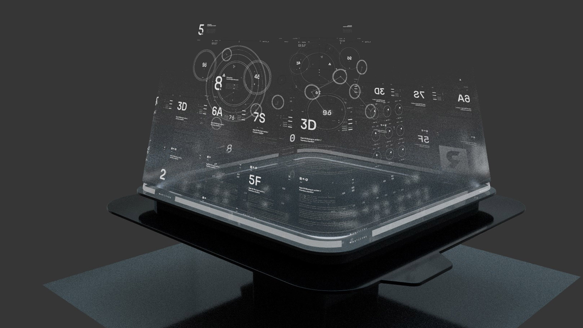
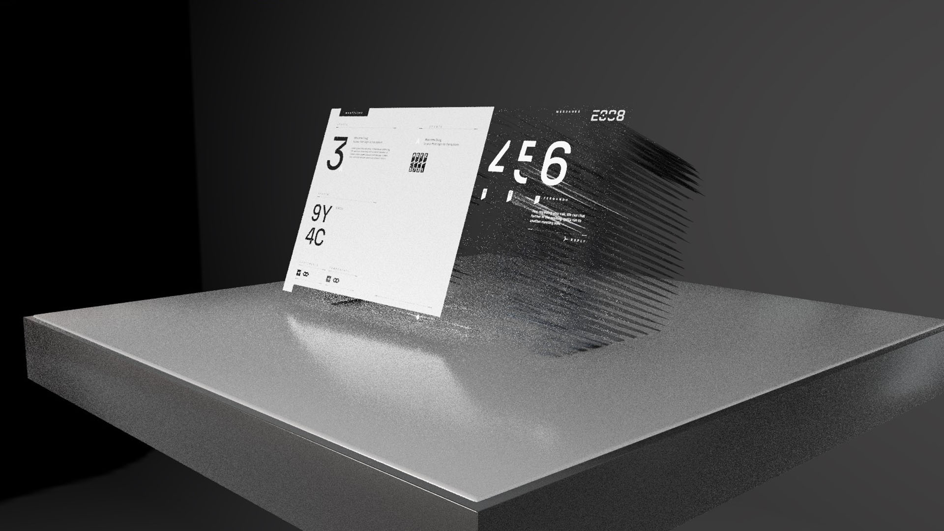
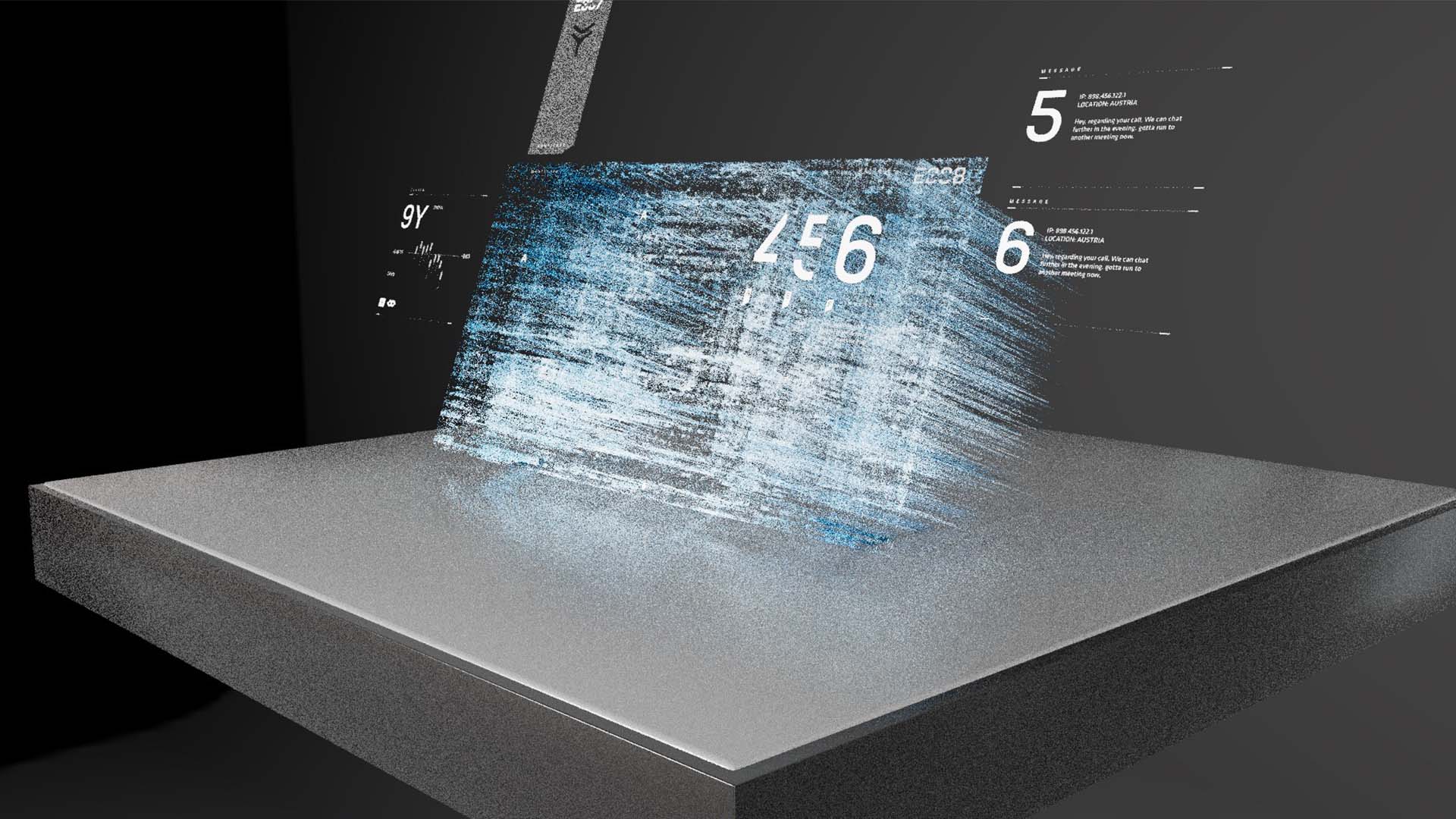
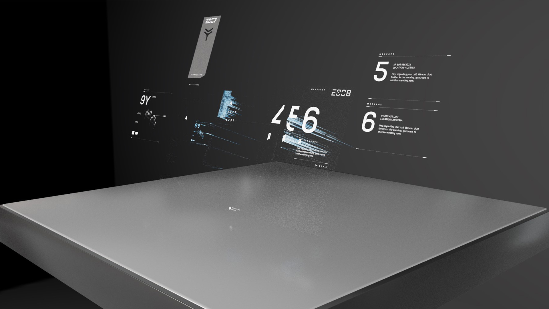
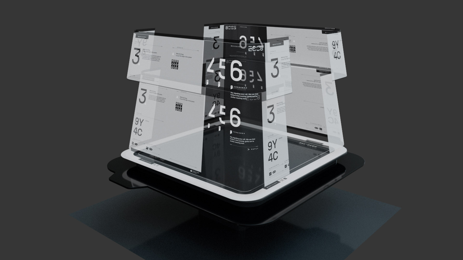
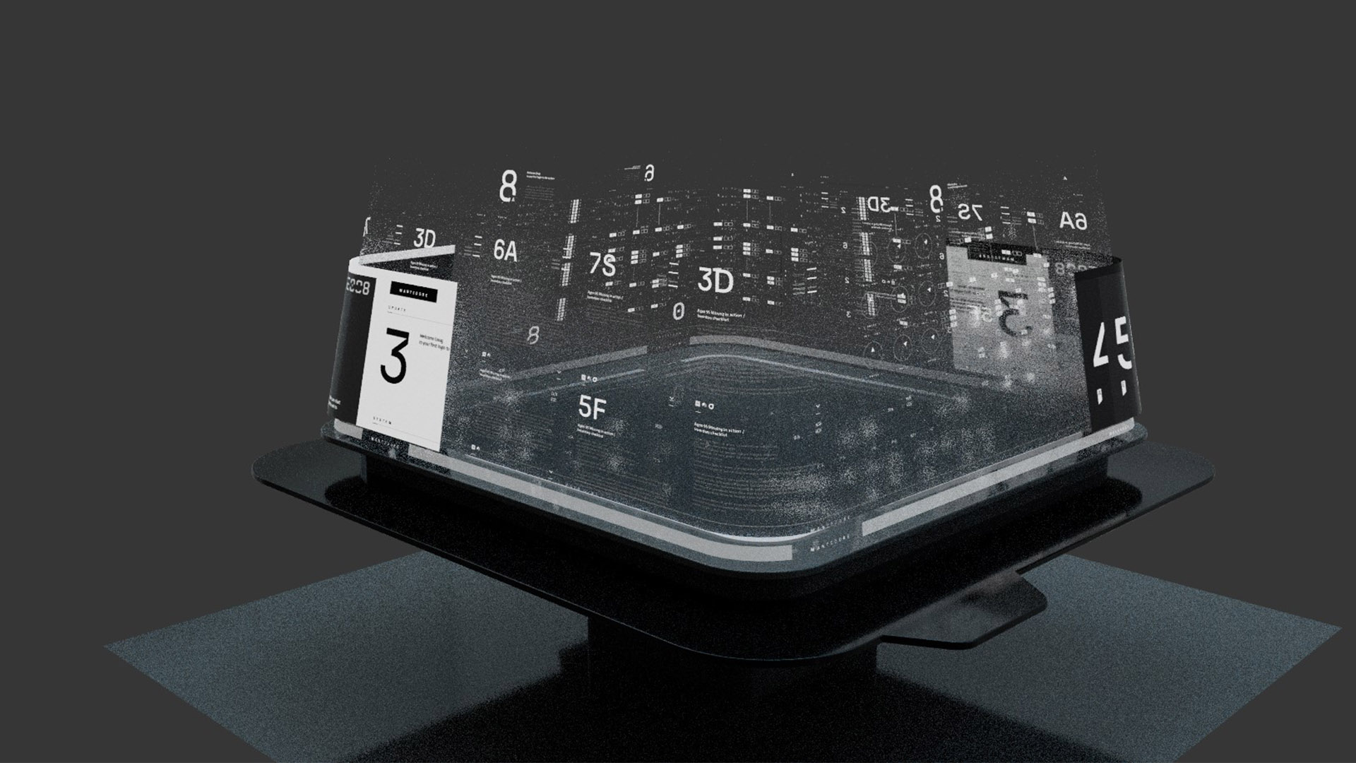
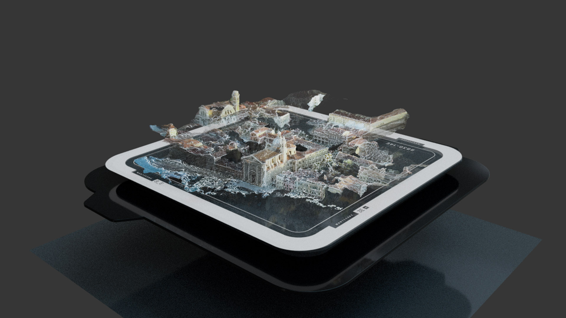
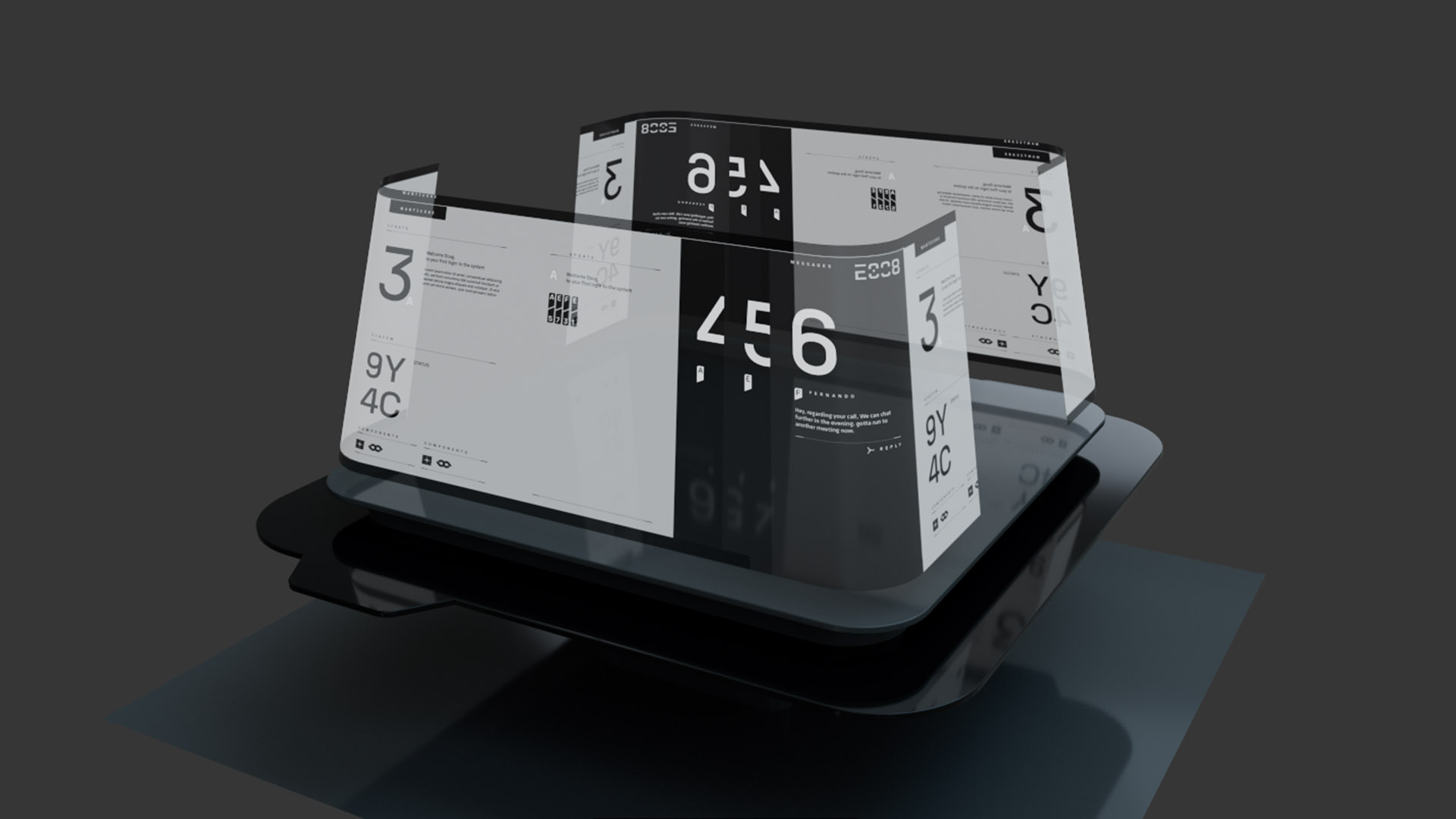
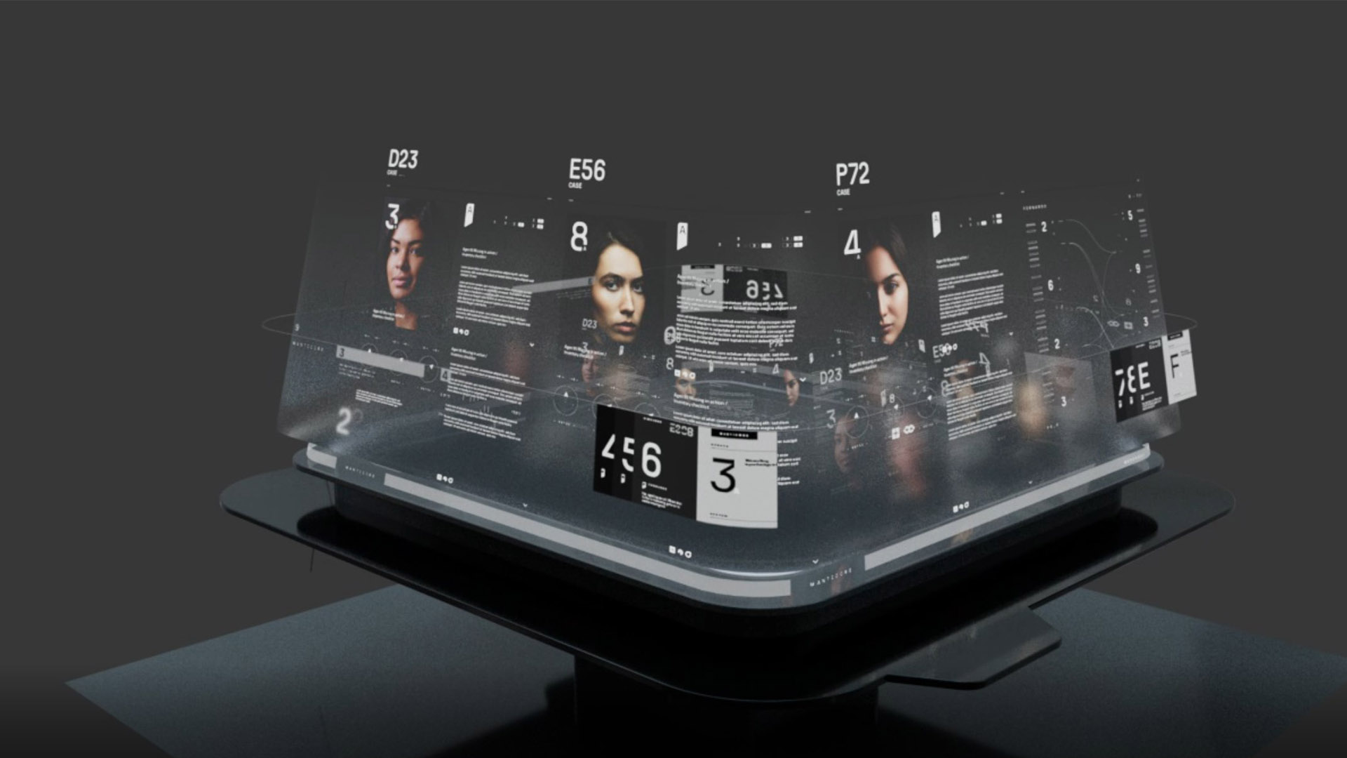
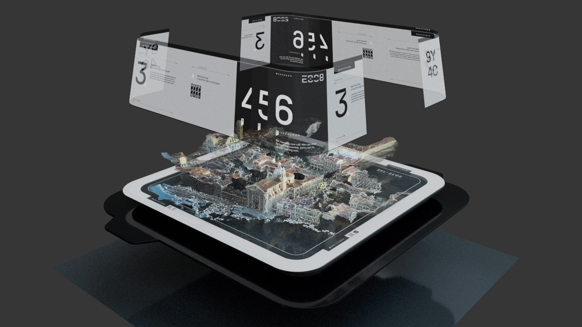
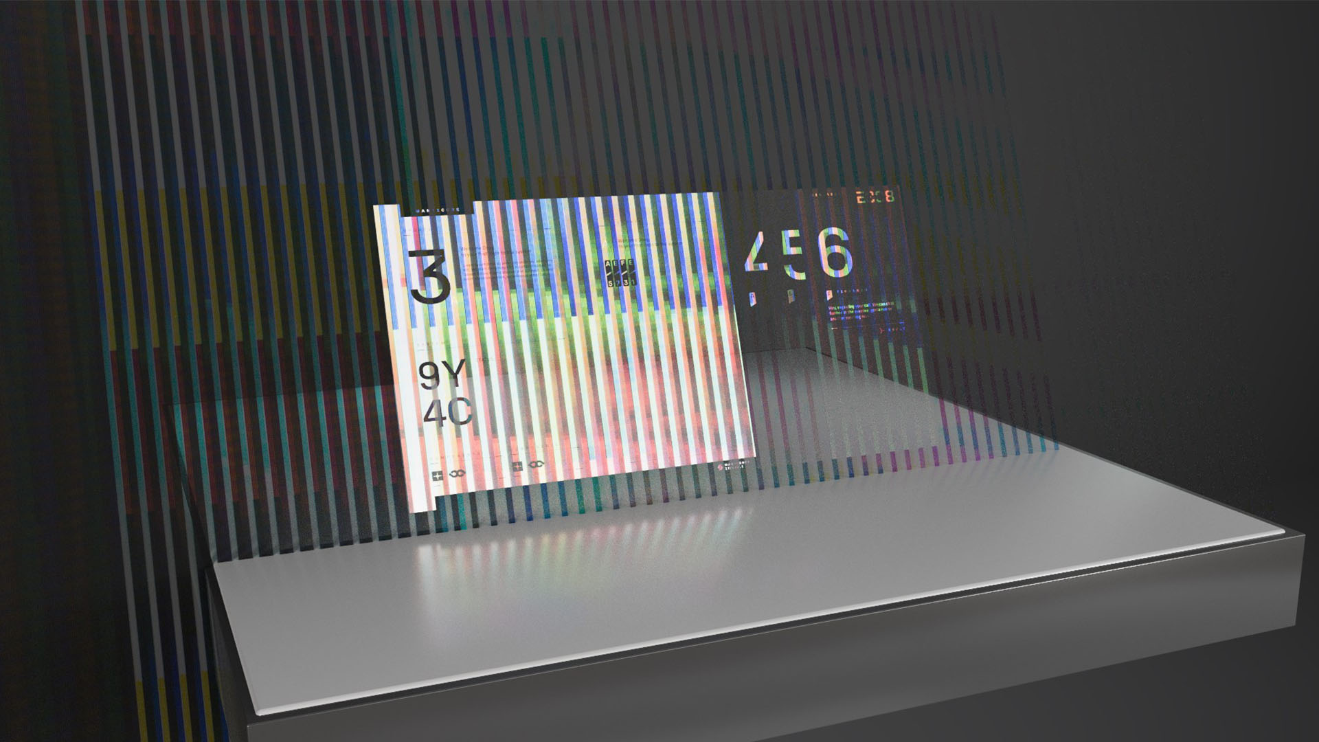
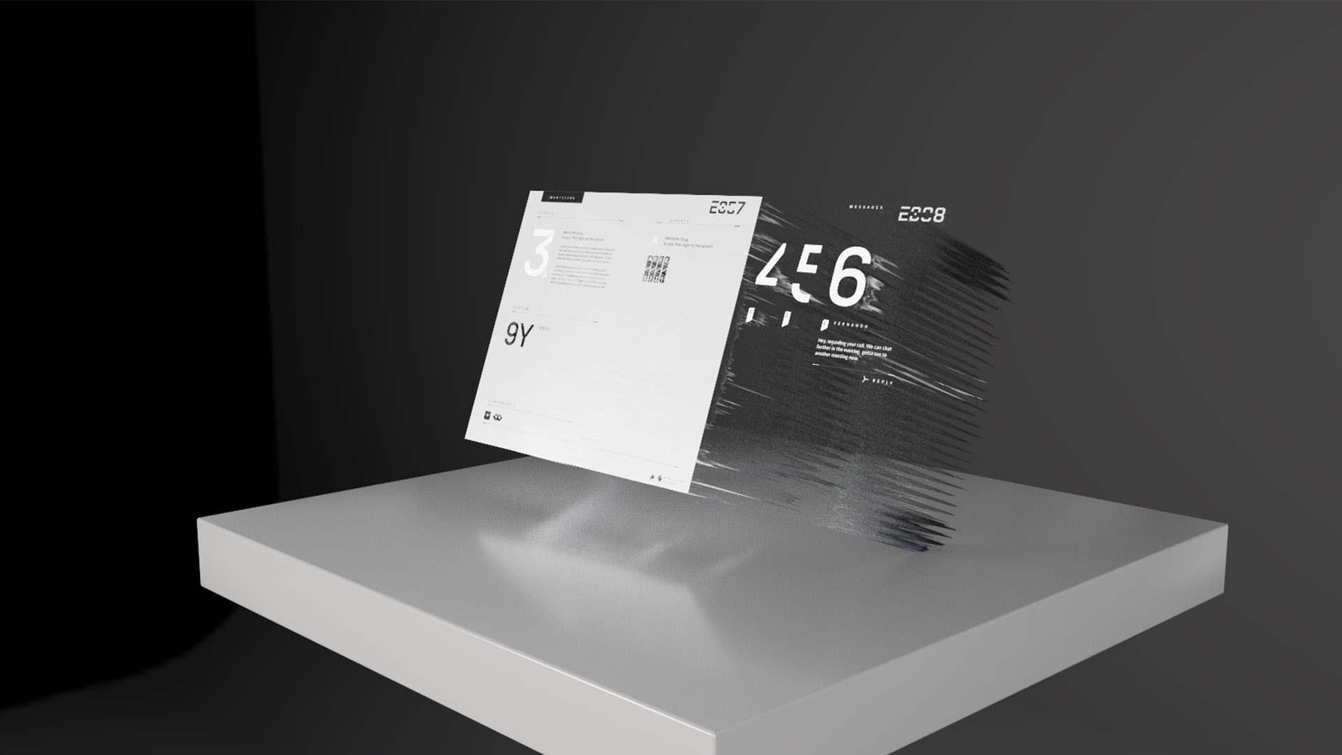
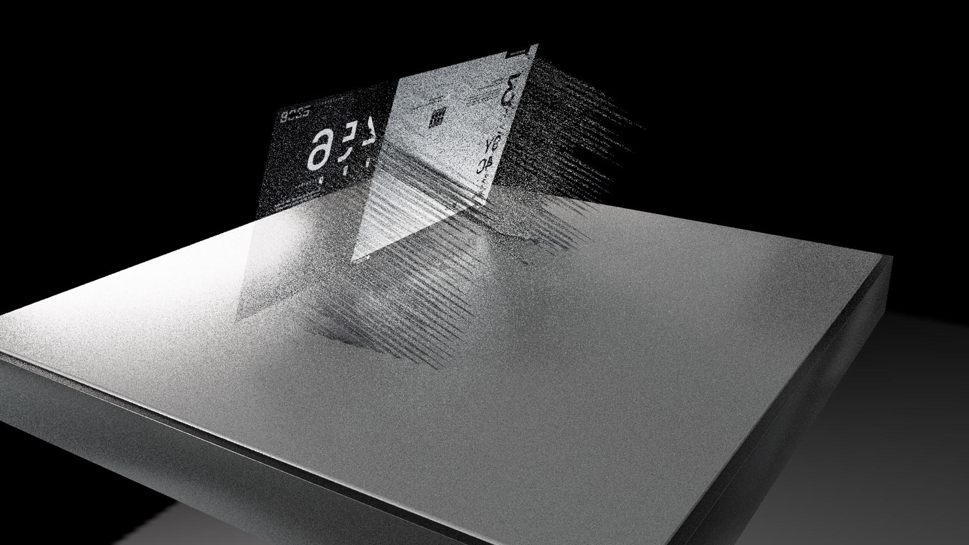
One of the core pieces for technology that we designed for the series was a large scale UI projection table. This is the main technology in the Manticore office headquarters and personal offices that agents can interact with to execute plans, interact with data and receive updates.
UI PROJECTION TABLE CONCEPTS
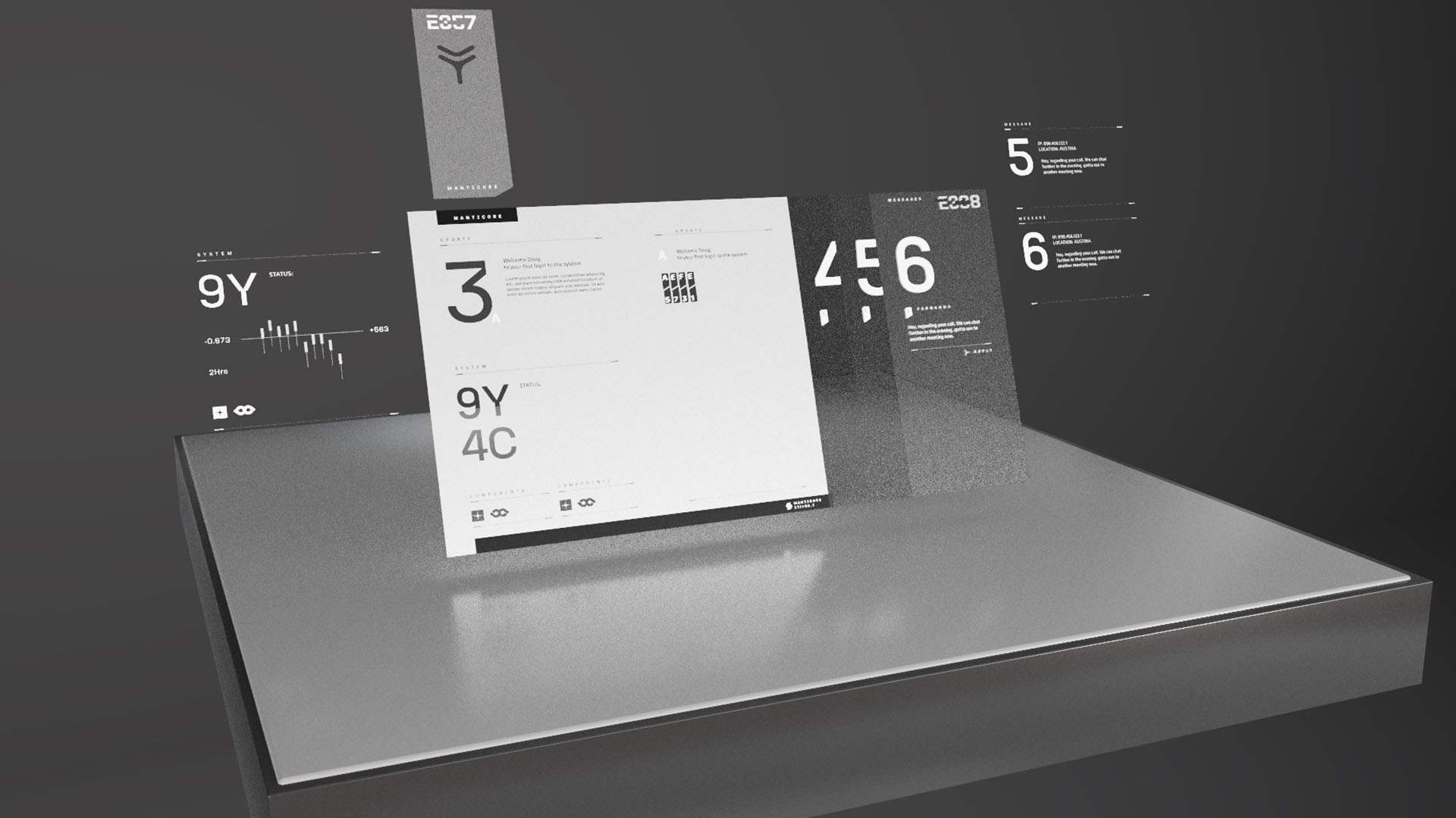
We constructed several different UI projection tables – large tables in the headquarters, medium tables for individual desks and small, handheld tables. These tables were all based on the same design but modified to ensure the UI fit within the various platforms without losing the original detail.
ACCESS DENIED MESSAGE LOOK DEVELOPMENT
In our early concepts for the UI projection table, we looked at brutalist architecture. We wanted the UI to feel utilitarian and slightly cold, which we found in brutalist design. We evolved and changed the design to fit within a more technological, UI environment that aligned perfectly with the atmosphere of Manticore.
EARLY DESIGN MODELS FOR THE UI PROJECTION TABLE
However, despite Manticore being the villains, we did not want all of their technology to be dark and red. By using bright colors like blue and green, we avoided the trope that “evil UI” is always red. This organization is aware that they are the antagonists, but they do not believe they are evil. Therefore, their UI should look like any other organization’s UI, but with hints of being cold and utilitarian.
BRUTALIST UI DESIGN
Our final UI projection table was crafted in Adobe After Effects and Cinema 4D. Each element of the table was animated in After Effects. Then, we brought everything into Cinema 4D for lighting and to be placed within the 3D space.
SMALL PROJECTION TABLES
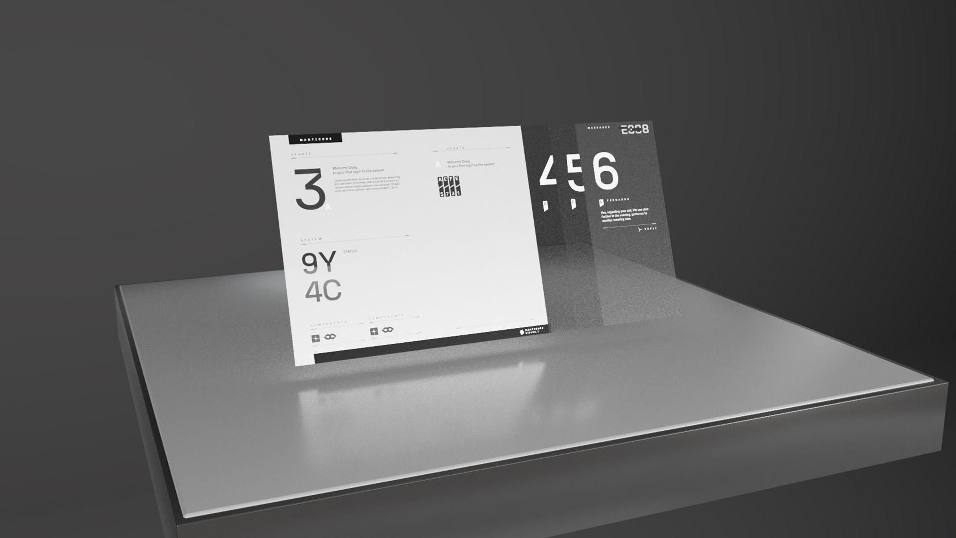
The small UI projection tables that we designed were miniature versions of the standard projection table. Since these tables can be picked up and moved, we explored different ways of formatting the data that is projected.
Some of the smaller tables are shaped like cubes, similar to the standard tables. Others project the UI on a seemingly flat “surface”, offering more room for interacting with complex data.
MONITORS
A secondary element of these UI projection tables that we designed were monitors. These monitors are synced to the tables and project data and information.
LONG MONITOR STANDARD UI
LONG MONITOR GLITCH UI
Our team designed two different styles of monitors – long, wide monitors and standard, square monitors. In the series, these monitors can be seen glitching with an access denied message as the Manticore facility faces threats.
SQUARE MONITOR GLITCH UI
05
CONTACT LENS
Citadel Diana’s main character, Diana, wears a set of contact lenses throughout the series that are connected to Manticore. These lenses give her information, scan security cameras, show maps, perform facial recognition and provide Diana with on the fly updates to help her navigate her surroundings and missions. We designed the main UI for these lenses and all of their functions.
CONTACT LENS START UP TESTS
CONTACT LENS UI MOTION TESTS
To craft these lenses, we began by laying out different UI formats. The design could not be too busy, since these lenses had to display information while still focusing on the scene. In each of our options, we tested how they could be used for the various functions Diana needs them for, such as driving, scanning and translation.
CONTACT LENS UI LOOK DEVELOPMENT
Since this technology is a major storytelling device, our UI could adapt to whichever plot point needed to be executed.
CONTACT LENS VIEW PERSPECTIVE CONCEPTS
In total, we created over 10 different modes for Diana’s contact lenses using After Effects. Each mode lives within the same design family with distinct details and keys to signify their purpose.
06
PHONE INTERFACES
Our team conceptualized several advanced phone screens for Manticore’s OS. While the phones are futuristic, we kept our designs grounded in order to keep the phones realistic and practical. While the content lenses and UI projection tables are more futuristic, these screens are consumer friendly with cutting-edge advancements.
EARLY PHONE OS CONCEPT
Citadel: Diana takes places roughly 8 years in the future. Therefore, we were aiming to design a phone that could be realistically available in the consumer marketplace in that timespan. We stayed away from holograms and glowing technology. Rather, we studied current phones, advancements made 8 years ago through today and explored how we could make similar and complex advancements to project smart phones further into the future.
PHONE DESIGN REFINEMENTS
Our overall designs for the phones have a militaristic edge and brutalist nature. The OS lives within traditional spy technology, allowing Manticore agents to blend in with the public and keep their technology under wraps.
FINAL PHONE INTERFACES
07
EDO LAB
For the Edo Lab, we designed a range of advanced technologies. Mainly, we designed the UI of large smart screen monitors. These monitors make up multiple displays throughout the lab.
EDO LAB UI
We designed all elements of these interfaces based on the predetermined sizes of glass brought in for filming. These displays range from smaller, compact displays to wall-sized screens. To create the Edo Lab, we used a combination of After Effects and Cinema 4D for the design and animation of the UI elements.
EDO LAB FINAL INTERFACES
08
BODY SCAN
When Diana enters the French Manticore Headquarters, she walks through a wall of lasers that scan her for weapons. We conceptualized how these lasers look, how they could scan her and the interface that monitors the results.
BODY SCAN LOOK DEVELOPMENT
We worked with the Amazon team to determine what style of scanning they wanted for the series. We presented concepts of a laser wall, a haze of lasers and direct point of contact lasers. Each involved unique patterns and motions to help the audience understand what the technology is looking for.
LASER SCAN MOTION TESTS
Ultimately, we landed on several point of contact lasers scanning specific areas of Diana’s body to search for weapons and danger points.
For the UI of the scanner, we wanted to communicate what the lasers were pinpointing during their scans. We included subject body shapes, data and calculations based on the results which would appear in real time as the lasers scanned across Diana.
09
BRACELET UI
Similar to our contact lenses, the bracelets of the Manticore agents are wearable technology that provide information and updates. These portable devices involve a wrap-around UI to provide the agents with critical data.
BRACELET UI CONCEPTS
To design the bracelet UI, our team experimented with different ways the technology could boot up and wrap around this thin platform. We also constructed several sample wireframes to help prioritize the data that is visual around the user’s wrist.
UI FORMAT SAMPLES
BRACELET WIREFRAMES
Since this technology helps display important narrative details, we wanted our UI to be formatted in a way that was both visually appealing and quickly legible for the sake of the audience. Our final design was completed using Cinema 4D.
BRACELET START UP TEST
While most of our technology was created for the Italian Manticore agents, the bracelets are used mainly by the French Manticore agents. The devices are connected to a larger network, but have some design differences from the Italian agents due to the differing headquarters. The French technology was more blocky and industrial.
FINAL BRACELET UI
BRACELET UI SCROLL
10
ORIGAMI TABLET
The origami tablet is a portable, futuristic pad that allows agents to communicate with one another. It can fold up into a small device, sit on a table with certain screens unfolded, or lay completely flat like a traditional tablet.
CONCEPT ORIGAMI TABLETS
To begin designing this tablet, we tested how the user could appear both on screen and off screen while the tablet was flat or folded. Despite the tablet having several orientations, we wanted our UI to adapt to whichever way the tablet was folded in order to show how advanced and seamless this technology is.
ORIGAMI TABLET UI MOTION TESTS
ORIGAMI TABLET SUBJECT DISPLAY TESTS
Unlike our Manticore technology, which was completely new to the Citadel series, the origami tablet is technology designed by the Citadel agency. For this tablet, we looked back at the technology that previously appeared in the American Citadel series and expanded upon it, progressing it several years into the future with advanced UI.
FINAL ORIGAMI TABLET UI
11
ELEVATOR PAD
Our team also designed a smart elevator pad used within the Manticore headquarters. This futuristic elevator pad is fully digital and incorporates identification verification.
Beyond designing the key pad, we also conceptualized the elevator UI. This UI calculates the distance to the desired floor while also keeping track of important data. Within the UI, we included features stating that the elevator is constantly recorded, file updates and elevator scans.
ELEVATOR KEY PAD
ELEVATOR UI
12
FRENCH MONITORS
In the French Manticore headquarters, the organization uses large, transparent monitors. We crafted the UI, layout and function animations seen on the screen. With our vast history in transparent technology design, we incorporated a bright, bleeding-edge touch on these narratively critical monitors. Since these monitors are in the French headquarters, all of the UI details, widgets and language is displayed in French.
FRENCH MONITOR INTERFACE
13
HEALING ROOM
The healing room is en egg-shaped pod that agents are viewing. We conceptualized the UI that covers this pod, incorporating critical medical data. This glass globe interface features vitals, medical history and real-time updates on health and conditions.
HEALING ROOM UI
14
CONCLUSION
It was an honor for our team at Perception to collaborate with the global teams at Amazon for this thrilling spy series. Our technology and UI has established the crucial design language and technological climate of Manticore for both Citadel: Diana and future series to come.


