01
INTRODUCTION
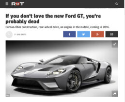
In 2014, Perception began discussions with Ford to bring Perception’s brand of forward-thinking UI design to a legendary vehicle, the Ford GT. The GT’s roots trace back to a 1960’s rivalry with Ferrari, and history-making wins at the sacred ground of LeMans. This modern interpretation of the GT was slated to be a radical technology and design showcase underlined with one key goal: to win races.
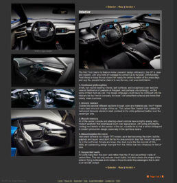
Ford came to Perception, knowing that their creative flare for cinematic UI (Iron Man, Robocop, Avengers) combined with experience in mission-critical HMI (CAE, and several confidential, high level aerospace collaborations) would be a perfect fit for the GT. After months of close collaboration with Ford’s design and engineering teams in Detroit and direct input from Ford executives and LeMans-winning racers, Perception crafted a dynamic HMI unveiled with the Ford GT at the 2015 Detroit International Auto Show.
02
CODENAME: PHOENIX
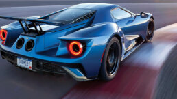
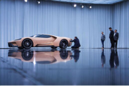
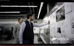
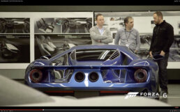
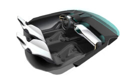
Perception was introduced to an initiative at Ford with unprecedented security— “Project Phoenix”. The majority of Ford’s designers and engineers were unaware that in the basement of their Product Development Center was a top-secret studio carved out specifically for this ambitious project. Perception was welcomed behind these secret doors to collaborate with a skunkworks-style design team, and witness project Phoenix evolve from sketches and clay models into the 600 horsepower carbon-fiber masterpiece known as the Ford GT.
Although this project set new standards for secrecy (and speed of development) within the automotive world, the team at Perception are no strangers to highly confidential projects in both the tech and entertainment worlds. Perception implemented their most secure practices, many of which exceeded Ford’s own standards, allowing confident collaboration whether on-site at Ford in Detroit, or working remotely from Perception HQ in New York.
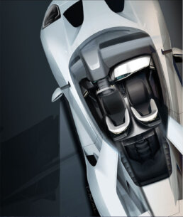
It was in the top-secret subterranean Phoenix studio that Perception learned about Ford’s goals with the GT: create a car that took its inspiration from the Orion Spacecraft and its attitude from the Ferrari-slaying GT of 1966. To create something that cherished design through purpose, with one purpose above all else: to be the fastest.
03
DESIGN EXPLORATION
Perception’s initial design exploration covered a wide range of options, allowing the Ford Design team to immediately zero in on which aspects and elements resonated with their goals for the GT. Within the range of designs and concepts Perception presented, there was a bias towards spartan, tactical UI. The message from Ford's design team was very clear to Perception's creative director John LePore, “Ferrari’s and Lamborghini’s are merely toys… the Ford GT is a weapon.”
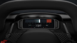
All designs places a primary emphasis on the tachometer – mandatory for any serious performance car. The majority of the concepts eschewed a traditional radial tach for the graph, allowing a more precise and legible readout. Legibility was a primary concern as minimizing time spent reading instruments would keep drivers eyes on the road longer — an admirable feat at 60mph, but a mission-critical objective at 160mph.
04
GRANULAR DESIGN
After initial reviews with the Ford team, Perception refined and perfected the designs. The team held themselves to a strict responsibility— every pixel had to prove it would make the driver faster, or else it was eliminated.
LeMans winning racer Scott Maxwell worked with Perception to ensure that all design decisions would contribute to something he was familiar with: winning races. Scott Maxwell insisted on a four-digit tachometer readout— the equivalent of measuring the Empire State Building in millimeters. While the enthusiast counts revs hundreds at a time, Maxwell feels every single one, and that intimate connection to the vehicle defines his ability to trim milliseconds off of his competitor’s lap times. The result of Maxwell’s influence is a professional-grade HMI that is still accessible to the enthusiast driver, but with a heightened sensitivity tailored to the world’s most capable drivers.
Gauge Cluster Refinement
05
FORD PERFORMANCE ECOSYSTEM
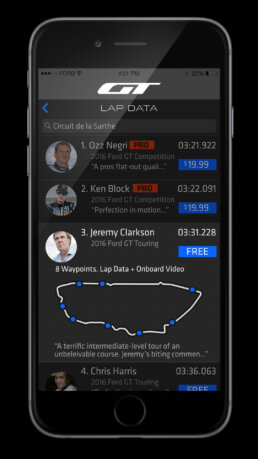
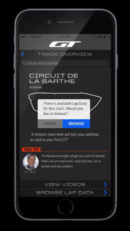
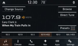
Perception generated concepts for numerous ways to extend the experience from behind the wheel, to mobile devices and wearables. First and foremost was an aggressive re-skinning of SYNC3, Ford’s proprietary in-car entertainment operating system. It was important to Perception to take a UI shared across every Ford (from Fiesta to Taurus) and tailor it to fit an exclusive vehicle and reflect the unique design cues within the GT.
In addition to the re-imagining of SYNC3, Perception was enlisted to conceptualize new ways of extending the experience beyond the car. This included everything from innovative controls for active aero body panels and suspension via remote app, to touchscreen friendly race-gloves and multi-camera video capture systems.
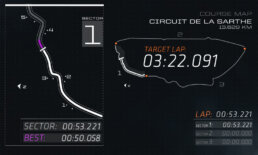
App UI
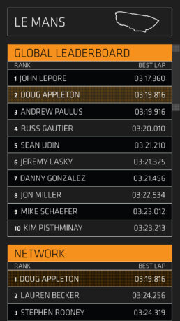
Leaderboard Design
Sync3 Tuned for GT
CAPACITIVE TOUCH
Iconography
06
DEMONSTRATION VIDEOS
These animated prototypes were crafted to show the UI coming to life long before the car was rolling on pavement. This allowed the designers, engineers, and race drivers to envision the experience months before they could climb into the cockpit.
ACCELERATION
This video shows the display responding to acceleration, braking and gear changes at race speeds. Immediately recognizable are the flashes of red across the entire tachometer at specific rev tolerances, allowing the driver to recognize an approach to redline solely through peripheral vision. Closer looks reveal thoughtful details like a gear indicator that shows the dual-clutch transmission’s pre-loading of an anticipated gear.
MODES
This sequence shows the display’s response to being cycled through four available modes: Wet, Sport, Sport+, and Race. While competitor’s vehicles have drastically different layouts between modes, the GT respects the eye’s muscle memory and maintains the overall layout, dilating and focusing on particular elements based on the severity of the mode.
LAUNCH
The Ford GT’s launch sequence prepares the car for a computer assisted launch optimal for 0-60 or 0-100 times. In turn, the instrument cluster prepares the driver by giving a glimpse of the systems that are being checked and prepared (think shuttle launch procedures). The end result builds towards one of the more visceral experiences available in any vehicle.
STARTUP
The startup of the Ford GT embraces the vehicle’s heritage with a sequence of systems booting-up echoing a row of toggle switches in a classic race car. The press of the “Engine Start” button is immediately responded with two emphatic gestures: one— a 600 horsepower twin-turbo power plant bursting to life inches behind the driver’s head. The other— a broad flash of light, sweeping across the display’s rev-range and bringing the instrumentation to life.
07
TEASER TRAILER
It was truly inspiring working with such a dedicated team at Ford Design, on a project whose pages in history are just beginning to be written. The Perception team couldn’t help but indulge their cinematic impulses, and assembled a teaser trailer to remind everyone involved of the emotional impact this project contains. Working only with Perception’s own generated assets, and a rough “wip” model of the interior (exterior 3d data was off-limits), Perception brought the vehicle to life, months before it would be rolling under its own power.
08
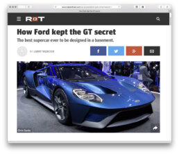
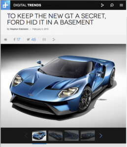
OVERALL RECEPTION
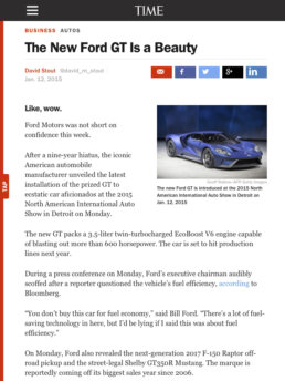
At the 2015 North American International Auto Show Ford stunned the automotive world with the reveal of the Ford GT. The revolutionary design and engineering of the car was universally praised, and publications, blogs and enthusiasts worldwide responded to the message of intent that the Ford GT stood for. Industry insiders were all amazed with every fine detail, as well as Ford’s ability to keep the GT shrouded in secrecy. Ford was recognized by all major automotive design publications, and Perception’s design of the HMI was flagged as an element that like Kubrick’s 2001: A Space Odyssey, “would stand the test of time”.
