01
INTRODUCTION
Our team at Perception collaborated with Sony, Insomniac and Marvel on one of the most highly anticipated games of the year, Marvel’s Spider-Man 2 on the PlayStation 5. This video game follows a synergetic and action-packed adventure between Peter Parker and Miles Morales. Our team was brought on to design a cinematic end title sequence to close out the game and celebrate the player’s journey.
Marvel's Spider-Man 2 End Title Sequence
02
PERCEPTION'S HISTORY WITH SPIDER-MAN
For over a decade, our team has been creating title sequences within the film, television and gaming industries. We also designed the title sequences for Spider-Man: Homecoming and Spider-Man: Far From Home, giving our team the perfect background for this collaboration. Spider-Man is a fan-favorite character amongst the Perception team, so when we began formulating ideas for the Marvel’s Spider-Man 2 title sequence, we pulled inspiration from our personal Spider-Man comic books, media appearances, previous Spider-Man games and our own Spider-Man film title sequences.
Spider-Man: Homecoming End Title Sequence
Spider-Man: Far From Home End Title Sequence
03
CONCEPT DESIGNS
As we moved into the concept phase of the collaboration, we sat down with the teams at Sony, Insomniac and Marvel to discuss potential ideas for the title sequence. The initial creative brief centered around creating dioramas filled with memorable scenes and moments from the game. With this seed of an idea in mind, our team put together concepts to bring the sequence to life. We knew we didn't want something that looked exactly like the game, so we explored looks that were hyper-stylized and unique from the video game experience.
CONCEPT 1: INK
We create scenes or “frozen moments” with the characters in a simple white space. Droplets of ink are dispensed into a water tank and begin to form incredible, colorful scenes. As the ink swirls and flows around the characters in the scene, it forms elegant organic patterns that highlight these key moments.
CONCEPT 2: SUNRISE
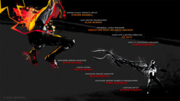
Based on the critical role of Venom in this game, this direction covers the titles in symbiote goo. Black splatters, splashes and puddles immerse the characters and scenes in a world completely controlled by Venom’s style, aesthetic and alien roots.
CONCEPT 3: PAINT
This concept focuses on texture and colorful contrast. Paint pours and coats characters to reveal alternative sides to their story. Drops of paint accentuate the dark, endless backgrounds where characters float in a void.
CONCEPT 4: CINEMATIC SYMBIOTE
The world consists of deconstructed materials - broken pieces of garages, buildings, cement. The Spider-Men and other characters are positioned on these shattered sets. A moving camera sweeps through the scene to reveal new layers and narratives.
CONCEPT 5: GRAPHIC COLORS
Sparse, minimalistic backgrounds offer hints of city skylines and sets from the game. The action is up front and center in this direction. Using graphic elements inspired by comic books and anime, characters are highlighted with energy lines and bold colors for a neon sequence.
CONCEPT 6: GRAPHIC TEXTURES
This concept expands on the Graphic Colors design. Instead of a bright, bold backgrounds, the details of these frames pop through neon line work, ink sprawls and splashes of color. These colorful accents make each character and action sequence flourish with personality.
04
FINAL DIRECTION
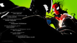
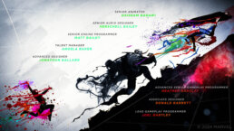
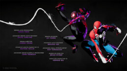
Our final direction for the title sequence of Marvel’s Spider-Man 2 is a mixture of each concept with a core theme of infestation, transformation and liberation. This colorful sequence shifts back and forth between light and dark, good and evil, continuing to pull ink drops, Venomized-goo, and bold designs from our concepts. Infestation is dark with slight color, transformation adds a bit more color, and liberation is full color with a white background.
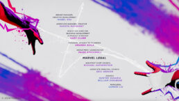
Using a bright, graphic treatment, the titles are based on “frozen moments” that support the story of the game. Shots begin tight and close to a certain character or plot piece. As the camera moves and shifts throughout the shot, more information is revealed to show a larger picture and more defined narrative. The camera movements range from slow and sweeping to sharp and punchy. We used the camera as an additional storytelling device to each smaller anecdote. This helped us build interesting vignettes while supporting nearly 700 credited names.
Camera Movement Test For Vignette Storytelling
05
CHARACTER MODELS
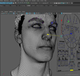
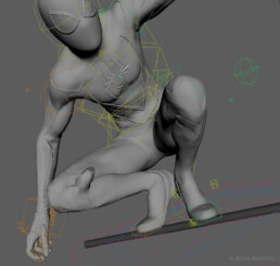
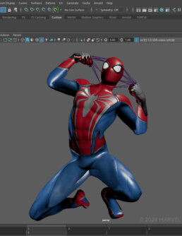
Despite not wanting the sequence to look exactly like the game, we needed each character to have the same characterization and personality from the game. We met with the game’s designers and story narrative designers to go through the entire plot of the game and study gameplay videos while recording the precise movements, poses and attitude of each character.
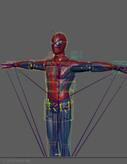
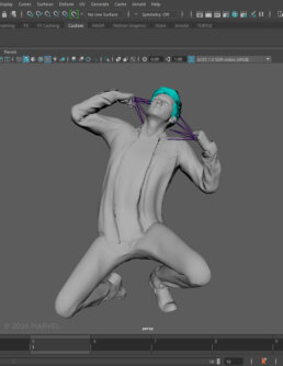
In order to ensure that the heroes and other characters were true to the game, the Insomniac team shared models and other assets with our team. Our artists worked first on key poses for each character, including faces, for approval to ensure our work matched the established look of the game. Using our gameplay references, we grabbed epic moments and character stances to mimic in our models throughout the sequence.
06
BUILDING THE SEQUENCE
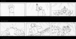
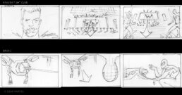
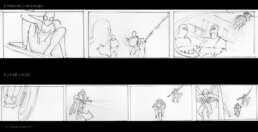
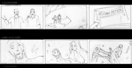
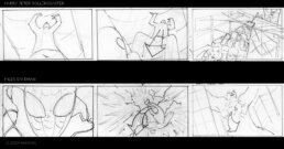
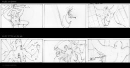
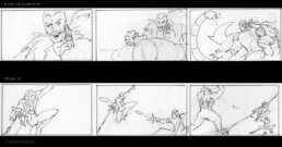
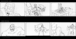
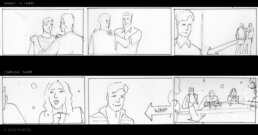
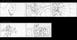
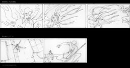
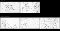
We began by sketching storyboards to illustrate the story beats and ideas we wanted to portray within the sequence. We put the storyboards together into an edit to build motion and see the narratives play linearly. This was not going to be a retelling of the game, but we wanted the audience to relive moments that felt like they were from the game.
INITIAL STORYBOARDS
Keeping our infestation, transformation, and liberation theme in mind, we wanted to juxtapose scenes together to feel like they were part of a bigger narrative and find pairings that would play towards our core theme. After meeting with Sony, Insomniac and Marvel, we collected additional ideas and put together our rough edit.
Storyboard Animatic
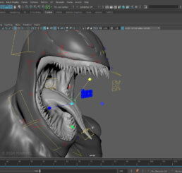
We then began building the sequence in 3D. We adjusted and refined character models using Maya. Once the characters were posed, we moved everything into Cinema 4D where we retextured the models and added in our camera movements. We rendered several lighting passes in Cinema 4D, along with diffusions and reflections. We continued to refine the look as the edit came together. After work in Cinema 4D was complete, we moved everything into Adobe After Effects for the final composite. Then, the final edit was rendered using Conductor.
Sequence Animatic
07
CRITICAL VIBRANCY
To support our dynamic character models, we included a vibrant color palette that painted the sequence with energy. Instead of sticking with the traditional blue and red Spider-Man palette, we opted to use an array of bright, complementary colors. The sequence includes Peter Parker, Miles Morales, several villains and supporting characters. Using complementary and purposeful colors, we were able to make both the character models and the credited names pop in every frame. We also enhanced textures using Cinema 4D, adding even more dimension and realism to make the colors pop.
REFINING MODEL TEXTURES
The colors also serve a secondary purpose of storytelling. We wanted to stray from the traditional dark and light colors equating with evil and good natures respectively. Within the game, every character is revealed to have certain motivations, reasonings and mindsets. By pairing good and bad characters with both light and dark colors, we’re emphasizing the personal intentions and beliefs of these characters. It helps the audience look beyond the “good” and “evil” and deeper into what makes these characters feel so human and real.
08
CUSTOM CODE FOR PERCEPTION'S LARGEST TITLE SEQUENCE
With over 700 names to list throughout the sequence, our team utilized a procedural and technical approach for the credits. Typically, we manually update each name in our title sequences when edits need to be made. However, the list of names in this game was so large that manual updates late in the process would have impacted our schedule and taken resources away from the creative polish work.
Venom Look Evolution
For Marvel’s Spider-Man 2, we worked with a technical director who specializes in creating toolkits for scripting and automating processes within After Effects. This procedural method of updating the names was based on a formatted Excel sheet, where names were broken up by department, pages and cards. Through this code, we simply updated the Excel sheet when edits were made to the names and the After Effects file would automatically update the project accordingly.
Venom Camera Movement Test
09
CONCLUSION
It was an honor to collaborate with the teams at Sony, Insomniac and Marvel on one of the most highly anticipated games of the year, Marvel’s Spider-Man 2. We live and breathe title sequences, Spider-Man and all things Marvel at Perception, and bringing them all together in our designs for such a prestigious gaming platform has been an incredible project for the entire team.
We are incredibly proud of all of our team members for their passion and dedication on this monumental title sequence! Thank you to all of the Perception team members for bringing this title sequence to life.
Marvel’s Spider-Man 2 is now available on the PlayStation 5.


