01
INTRODUCTION
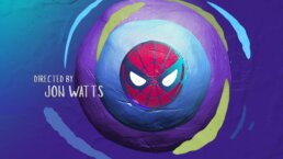
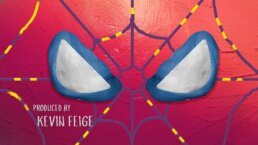
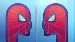
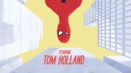
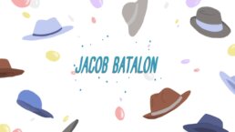
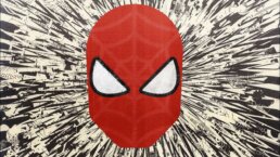
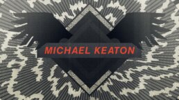
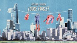
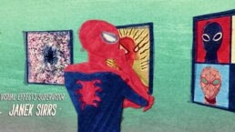
Spider-Man: Homecoming marks Spidey's much anticipated solo debut into the Marvel Cinematic Universe. With this momentous backdrop in mind, Marvel Studios' executive producer Jeremy Latcham and director Jon Watts approached us to collaborate on the main on end title sequence for the film.
"They came to us with the idea that this title sequence should feel like a high school art class project— a little rough around the edges, a wide variety of mixed media, but with tremendous heart and energy,” explained Jeremy Lasky, partner and co-founder of Perception, who initially spoke with the Marvel Studios team about the project.
We quickly dusted off our old smocks and jumped into art class mode to create a unique title sequence with the same charm and personality as the movie itself.
Breakdown Video Doc
02
THE CREATIVE PROCESS
Beyond the initial brief, the studio also noted that the titles should feel like a continuation of the story and continue the momentum from the closing moment of the film. We decided to approach the project along two paths. The first was an exploration of aesthetic directions and artistic mediums, while the second saw our team creating iconic story vignettes for Spider-Man's day to day heroics.
03
INITIAL CONCEPTS
CLAYMATION
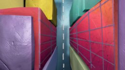
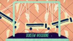
A playful animation embracing all of clay's unique imperfections.
VIBRANT MURAL
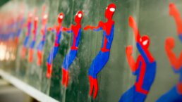
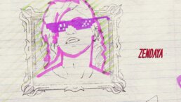
Inspired by murals on the walls of a high school hallway this direction retells moments of Peter Parker's day.
THE SURREALIST
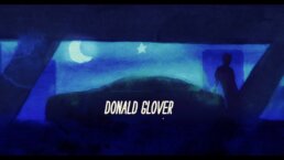
Surreal depictions of Spider-Man's day to day adventures.
THE PUNK ROCK POSTER SERIES
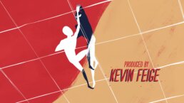
These posters call back to the days of high school bands' DIY handmade photocopied fliers.
ILLUSTRATED DAYDREAM
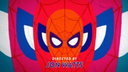
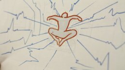
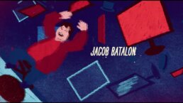
Everyday life becomes a canvas for a daydreaming Spider-Man's doodles.
Spider-Man Homecoming Early Motion Study 1
Spider-Man Homecoming Early Motion Study 2
Spider-Man Homecoming Early Motion Study 3
Spider-Man Homecoming Early Motion Study 4
04
STORY CONCEPTS
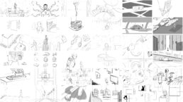
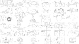
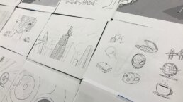
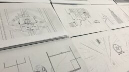
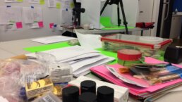
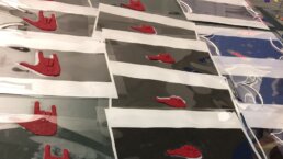
In addition to exploring artistic mediums, we created a variety of story vignettes to explore the continuing adventures of everyone's favorite local superhero. These moments were printed and hung up to create the first storyboards of the sequence. Throughout the process the storyboards evolved as new moments were created and old ones were taken down to build the final sequence.
“In addition to exploring unique aesthetic approaches and different artistic mediums we put together a long list of potential story concepts for these little narrative vignettes,” explained John LePore, Chief Creative Officer at Perception. “The studio also helped us out by sharing a lot of ideas that were cut from the film or ideas that were left out of the script, but things that helped give us context for the ways that Spider-Man existed in his more low-key day-to-day life.”
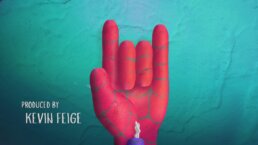
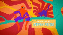
“We ended up sketching hundreds of these little moments and put them all up on our wall so we could visualize how everything would flow together, added Doug Appleton, Perception’s Visual Effects Director. “We’d try a few out on the wall and then replace them as we refined our vision, which made for a really organic, fluid process. With Marvel Studios’ input, we started to really dig into which credit best matched each moment. So, for instance, we have executive producers Kevin Feige and Amy Pascal together on the best friend handshake sequence because they were the ones that made the landmark deal between Marvel and Sony–which made this entire film possible. There are a lot of fun little nods like that throughout the sequence.”
Spider-Man: Homecoming Animatic
05
FINAL PROCESS
After the initial presentation showcasing a vast range of potential stylistic approaches, the team at Marvel Studios gave an emphatic "Yes" to nearly every artistic medium. For most projects this would mean finding a way to combine six directions into one cohesive look, but for this project it meant creating a sequence that embraced the differences and unique qualities of each medium.
This raised some interesting challenges for us - first, how to create a process that will provide the flexibility of working digitally while still maintaining the handmade quality of it all, and second, how to make sure that these six styles aren't going to clash and that the piece feels like one complete thought.
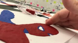
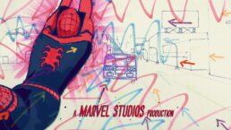
"One of our biggest concerns with doing an entirely handmade title sequence was figuring out how to to address inevitable requests from Marvel without having to throw out large chunks and start over,” explained Appleton. "We decided to rough out the entire sequence in After Effects before we touched a single piece of paper. We would then print it out and draw, sculpt, or paint over it, and then photograph it or scan it, and finally it would go through compositing. It was an intricate process of working both digitally and practically. And to ensure the most flexibility in the future, each shot was created in multiple layers. So, if we ever had to change a single element, like how quickly Spider-Man climbs up a wall, we wouldn't have to remake the whole sequence."
LePore added, “While some of this was happening entirely in the physical world— sculpting clay or drawing in pencil frame-by-frame, other shots had digital components to them as well. But everything had real world textures and materials to remain true to the art class approach.”
Spider-Man: Homecoming R-Train Animation Breakdown
To make sure everything felt like it lived as one complete thought, we had two solutions. We would work within a limited color palette for every shot and we would create energetic “pops” as a consistent element that ran throughout the entire sequence.
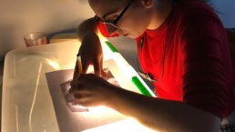
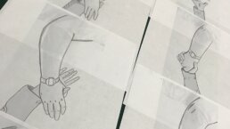
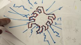
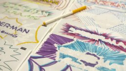
“We took the entire nearly completed sequence and printed out over a thousand individual frames” explained LePore. “Everyone in the office took turns tracing over the frames with markers, making various patterns and textures. By the time we were finished, each shot had 20-50 (in some cases 100+) of these hand-drawn overlays that were all executed just by printing out every frame and drawing right on top of it.”
Both the structure of the project and finished product had to have a cohesive design while also feeling improvisational. Any time something began to feel too sleek or refined, we would pull back and embrace the imperfections. This process helped maintain the warmer human touch that comes with making something by hand.
LePore said, “It’s really different from a lot of the work that we do here. I don’t think we had anything directly in our portfolio that spoke to this specific style, but since we had worked with Jeremy (Latcham) several times in the past, he trusted that we would be able to bring our own creative approach to it and give it its own unique twist.”
“I love that this sequence is so incredibly different from anything we’ve done in the past,” added Appleton. “This sounds super cheesy, but it gave us the opportunity to go back to how we were making art before any of us ever touched a computer. It was great to, quite literally, get our hands dirty.”
06
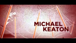
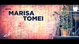
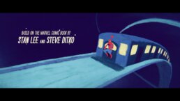
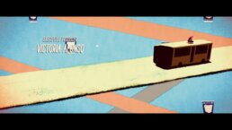
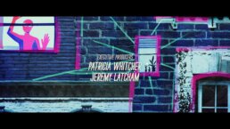
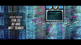
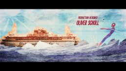
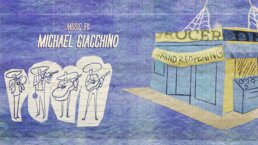
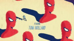
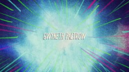
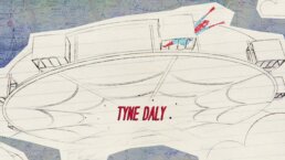
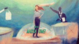
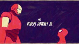
FINAL MAIN ON END TITLE SEQUENCE
“PLEASE THANK EVERYONE AT PERCEPTION FOR ANOTHER PIECE OF ART !!”
VICTORIA ALONSO
EXECUTIVE VICE PRESIDENT
MARVEL STUDIOS
Spider-Man: Homecoming Main On End Title Sequence
07
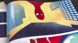
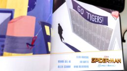
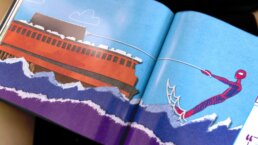
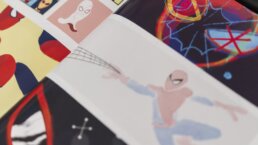
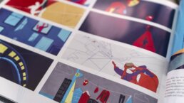
THE ART OF SPIDER-MAN: HOMECOMING
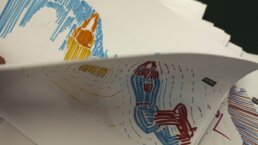
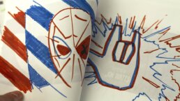
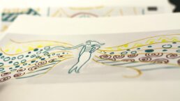
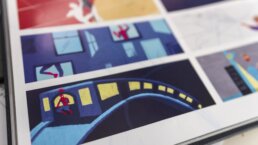
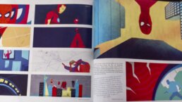
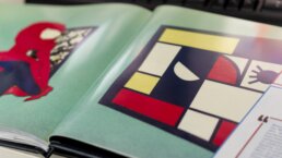
Our groundbreaking work on the main on end titles was featured in the book The Art of Spider-Man: Homecoming showing some early sketches of the title sequence.
