01
INTRODUCTION
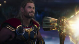
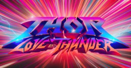
Marvel Studios approached our team at Perception to design a cinematic main on end title sequence for their newest film, Thor: Love and Thunder. This film follows Thor (Chris Hemsworth), Doctor Jane Foster (Natalie Portman), Valkyrie (Tessa Thompson) and Korg (Taika Waititi) on their journey to defeat Gorr the God Butcher (Christian Bale). This vibrant, energetic film includes an incredible soundtrack filled with a collection of 80’s rock. With this as our basis, we began brainstorming our sequence.
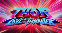
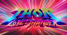
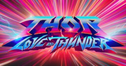
Thor: Love and Thunder Main on End Title Sequence
02
INSPIRATION
Thor: Love and Thunder is a bright and colorful film with a strong '80s hair metal influence. We wanted our sequence to match these themes to compliment the aesthetic of the movie. Our team developed several concepts, and we landed on a celebration of rock bands as our final direction. This sequence would focus on the names of everyone involved in the movie, with their credit stylized like an '80s rock band logo. The background would be full of life, electricity, and showcase variety of colors blasting the screen throughout the sequence.
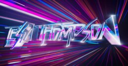
Title card shading and color exploration
03
DEVELOPING THE LOGOS
We began the logo development process by researching the big hair metal and classic rock bands of the '80s. We studied each logo to understand what made them so unique and recognizable outside of the music that their respective bands created. None of their logos ever looked like letters that were simply typed up, so we researched how those details were developed. From there, we had a team of custom lettering designers help us create the intricate details of typography and how to best utilize those details in order to craft an aesthetically pleasing yet legible sequence.
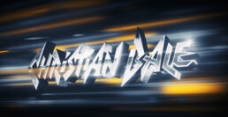
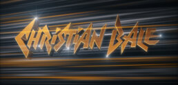
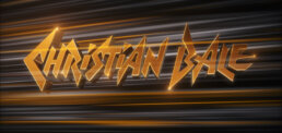
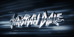
Christian Bale logo look development
As we began narrowing down our various lettering styles, we discovered that each logo fell into one of three categories: soft, block, or sharp. The soft logos included loops, swirls, and implied motion.
The block logos were chunky and thick, with weight and strength.
The sharp logos had ragged, pointed edges and felt inherently exciting and electric.
04
CUSTOM MADE TYPE
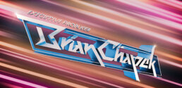
In this sequence, each of the logos were custom designed typography with bold, graphic detailing. Each type was created specifically for this sequence, inspired by the rock band aesthetic to be loud and energetic. Each letter was built to be dynamic and powerful to elevate the excitement of the end of the film. We developed over 250 type face explorations to perfect each style.
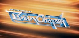
Brian Chapek Look Development Frames
05
THE TECHNICAL PROCESS
We began by hand drawing each logo in Adobe Illustrator. Once the design was chosen, we would refine and vectorize each logo in Adobe Illustrator and Adobe Photoshop. Afterwards, the logos were pulled into Cinema4D where we added depth and dimension to each name.
The lines in the background were created by adding cloners and shapes that were moving towards the screen. Everything was then textured and rendered in Redshift before being brought into Adobe After Effects for compositing.
06
A PERSONALIZED TOUCH
We worked closely with Director Taika Waititi and the entire team at Marvel Studios every step of the way, from our initial pitches to finalizing the sequence in preparation for the premiere of the film. Once we had a chosen direction, we began designing “band” logos for every single name. We discussed logo options with each member of the credited team to figure out what style of logo they preferred. We wanted to personalize the logo to everybody who worked on the film, taking into account their individual style, personality and unique design opportunities that the letters of their name offered us.
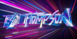
Tessa Thompson logo shading and coloring exploration
We also added extra details to certain cards throughout the sequence. Chris Hemsworth’s card has little lightning flares and is colored red and blue to match his new suit from the film. Christian Bale’s logo is black and white with gold accents, reflecting the color palette and eyes of his character, Gorr the God Butcher. Even Russell Crowe’s logo is finished with gold as a reference to him playing Zeus.
07
A VIBRANT BACKGROUND
To match the colorful nature of the film, we created a vibrant, energetic background to move along the back of each card. Inspired by the perpetual motion of the Bifrost, we crafted a rainbow array of laser lights to flow and stream across the sequence. These lights mimic and represent iconic laser light shows from '80s rock band concerts. Each card’s respective background utilized a color scheme that both compliments and emboldens the logo its supporting.
While this sequence is bold and bright, it was important to make sure that there were high levels of energy to take it to the next level. Rapid, swift camera movements, constantly moving lights and dynamic animation helped keep the sequence alive and powerful. Each of these movements were carefully crafted to make the audience feel like they were experiencing a Thor-level rock concert.
Thor: Love and Thunder Main on End Title Sequence Background Only
08
ADDITIONAL CONTRIBUTIONS
MARVEL STUDIOS LOGO
With every film and series that our team collaborates with Marvel Studios on, we update and customize the opening Marvel Studios logo animation. For Thor: Love and Thunder, we swapped out and updated clips to include new characters, scenes and moments from recent films. Can you spot all of the changes?
Marvel Studios opening logo animation for Thor: Love and Thunder
GORR'S VISION
At the beginning of the film, Gorr takes hold of the Necrosword and has a premonition that flashes him into his future. We created Gorr’s vision and the effect shown as Gorr goes in and out of the premonition. We considered what this future could look like, how it’s happening, why it’s happening, and what mechanisms are being utilized to make this foreboding hallucination occur. Since vision are often related to dreams, we developed this sequence to appear organic, hazy and surreal.
Gorr's Vision Sequence
09
CONCLUSION
It was an honor to collaborate with the team at Marvel Studios on Thor: Love and Thunder. This exciting action film is full of zest and richness, and it was incredible to craft a sequence to match that.
To see more work that we’ve done for the previous Thor films, check out our Thor: Ragnarok title sequence case study and our Thor: Ragnarok technology case study!
